Product
Announcing Bun and vlt Support in Socket
Bringing supply chain security to the next generation of JavaScript package managers
brandai-storybook
Advanced tools
The Brand.ai viewer displays UI Components from a Brand.ai Design Library in Storybook.

Install:
Storybook 2.x
npm install --save-dev brandai-storybook@"<1.0.0"
Storybook 3.x
npm install --save-dev brandai-storybook
Create a file called addons.js in your storybook config (default: .storybook) and add the following to addon.js :
Storybook 2.x
import '@kadira/storybook/addons'
import register from 'brandai-storybook';
register({ dataUrl:'<brandai-data-export-url>' });
Storybook 3.x
import '@storybook/react/addons';
import register from 'brandai-storybook';
register({ dataUrl:'<brandai-data-export-url>' });
In order to obtain the url required to connect to brand.ai, you first need to navigate to Brand.ai and log in. Once you're logged in, select the design library that you want to connect to React Storybook and click the Tools and Integrations in the header.

From the tools and Integrations page select the Style Data Export application.

In the Style Data Export application click on JSON in the left navigation menu and copy the Styles url

Note that you will need edit permissions to the design library to connect components.
To connect a component, the design library must be in edit mode

Click UI Components in the navigation menu and click on a component to see additional information.
Copy the story URL from your storybook and paste it into the story URL field

You're done. Refresh your Storybook and you should see a Design Library tab in the Storybook panel.

In Brand.ai's view mode, you'll see a link from the component to the component in Storybook. This allows you to easily switch to the code view of the component directly from your design library.
Note that if you change the story kind or story name in Storybook, you'd need to enter the updated story URL in Brand.ai.
If you want the same Brand.ai component to be displayed for multiple stories of the same kind, you can paste a partial URL containing only the selectedKind
http://localhost:9001/?selectedKind=Button
FAQs
Brand.ai React Storybook addon
We found that brandai-storybook demonstrated a not healthy version release cadence and project activity because the last version was released a year ago. It has 1 open source maintainer collaborating on the project.
Did you know?

Socket for GitHub automatically highlights issues in each pull request and monitors the health of all your open source dependencies. Discover the contents of your packages and block harmful activity before you install or update your dependencies.

Product
Bringing supply chain security to the next generation of JavaScript package managers

Product
A safer, faster way to eliminate vulnerabilities without updating dependencies

Product
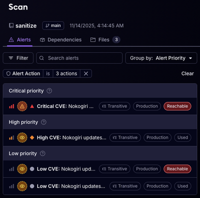
Reachability analysis for Ruby is now in beta, helping teams identify which vulnerabilities are truly exploitable in their applications.