Figmagic
Automate the generation of design tokens and specs from your Figma documents. Inspired by Salesforce Theo.
- Extract design tokens for colors, typography (line heights, font sizes, font families), spacing, and grids.
- Get design specifications for all of your Master Components.
Note: Requires that your document structure is identical to what I show in the template site at https://www.figma.com/file/KLLDK9CBSg7eAayiTY3kVqC8/Figmagic-Design-System-Example.
Approach and use cases
There's a lot to say here about the use cases and approaches taken by other tools. I will be writing an article on the motivations behind the project later on.
The basic idea of Figmagic is to support an informed handoff between designers and developers. I believe the best way to do this in a solid, mature, and non-impeding way is:
- Expect relative and current value types that are optimally suited for each typology (unitless for line heights, rems for font sizes...). Don't use or expect px values in most cases.
- Transform values into a common set of tokens rather than output exact values, ie. use something like ${colors.midGray} rather than #3C3C3C.
- Ease the process of making, generating and using design specification by giving solid contextual understanding rather than being imperative and unnecessarily detailed
Example project
An example project—using React, Webpack and Styled Components—is available at https://github.com/mikaelvesavuori/figmagic-example.
Installation
You can use Figmagic either as an NPM package in its own folder, or as part of your projects. It is assumed you will use it as a dependency.
Standalone
Running it standalone might be fine if you wish to isolate the tokens/spec generation, or if you don't have a project in which to place Figmagic, or if it simply makes more sense to have it on its own (for example doing a project in a non-Node environment).
Use . as a value in the path in the NPM config block to resolve from the Figmagic root.
- Clone/download the repository
- Place it where you want it!
As part of a Node.js project
You will probably want to use it as a straight dependency.
- Add Figmagic as a project dependency, by running
yarn add figmagic -S or npm install figmagic -S - Add the below commands to your NPM scripts block
- Replace with your own file ID and token key (for more on this, go to Figma's developer docs)
Key/token locations
package.json: In the scripts block you will need to change the blanks to your actual file and tokenmeta/keys.js: In the options object you will also need to change to your actual values; these are then used by Figmagic's functions
Commands
The Figmagic commands (NPM scripts block) is below, listing what commands are available to you.
"config": {
	"figmagicPath": "node_modules/figmagic"
},
"scripts": {
	"figmagic": "yarn figmagic:clean && yarn run figmagic:saveFromApi && yarn figmagic:build && yarn figmagic:getImages && yarn figmagic:downloadImages",
	"figmagic:clean": "rm -rf specs/ && rm -rf tokens/ && rm -rf figma",
	"figmagic:saveFromApi": "mkdir -p figma && wget 'https://api.figma.com/v1/files/{FILE}' --header='X-Figma-Token: {TOKEN}' -O figma/figma.json",
	"figmagic:tokens": "yarn figmagic:clean && yarn figmagic:saveFromApi && yarn figmagic:build",
	"figmagic:build": "node $npm_package_config_figmagicPath/bin/index.js",
	"figmagic:getImages": "node $npm_package_config_figmagicPath/bin/getImages.js",
	"figmagic:downloadImages": "node $npm_package_config_figmagicPath/bin/downloadImages.js"
}
Figma setup
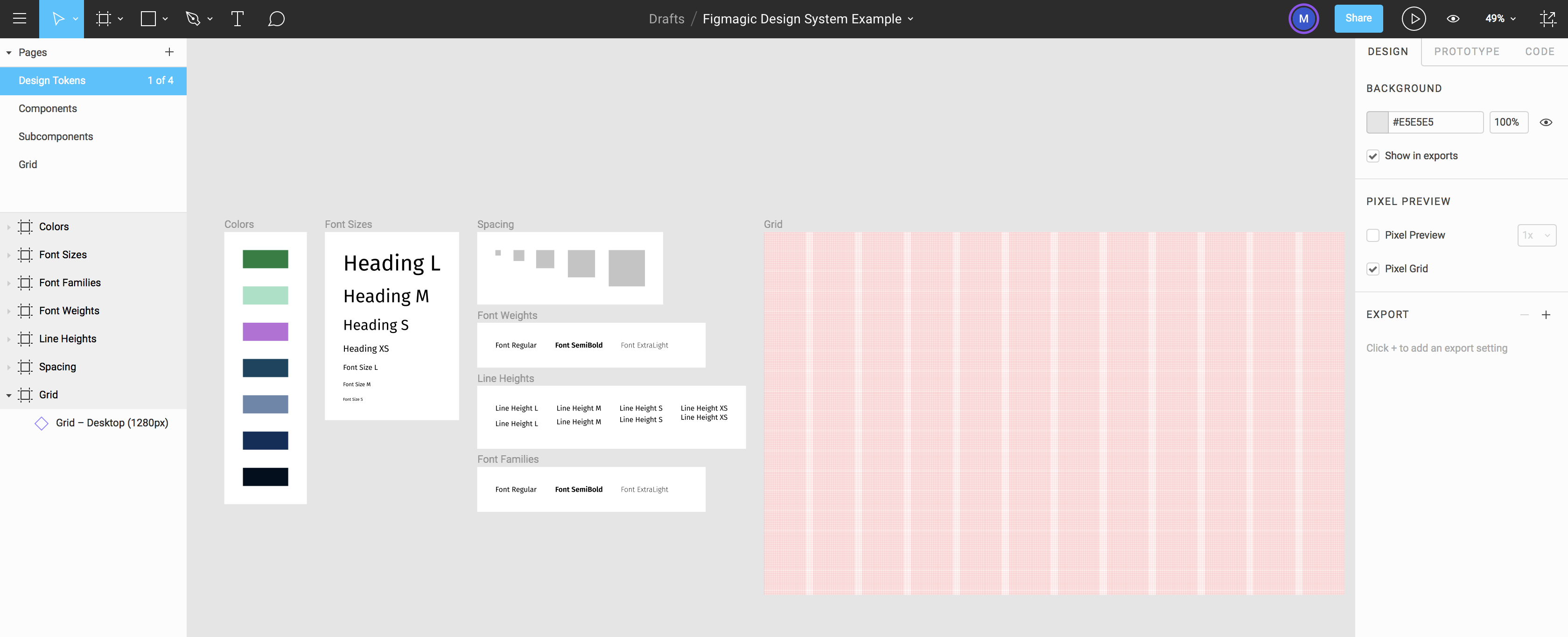
Your structure needs to correspond to the following:
- Pages need to exist and be called "Components", "Design tokens", and "Grid"
- Further, inside "Design tokens", frames need to be called "Colors", "Font sizes", "Font families", "Font weights", "Line heights", and "Spacing" – exact casing is not important, however the spelling is important!
- All items on a page need to be contained within one or more frames
See a demo/template at https://www.figma.com/file/KLLDK9CBSg7eAayiTY3kVqC8/Figmagic-Design-System-Example.
Note: You must follow the document structure as seen in the image below and in the template linked above.
Token formatting/conversion
Grid
Uses any combination of rows, columns, and grid (but only one of each type). Grid sizes will use the native Javascript Math.floor() function to round down any decimal values. This may or may not cause issues, but is at least more hygienic than leaving potentially weird numbers for grid sizes.
Font families
Postscript name (eg. FiraSans-Regular).
Font weights
Work in progress.
Font sizes
Rem units based on global font size (base 16px, change this within Figmagic also, if you've altered this value in your CSS).
Line heights
Unitless.
Colors
RGBA colors.
Spacing
Em units.
Spec output
Specifications for components are generated into the specs folder. A component will be anything that Figma catches as a component, regardless if they exist in your "Components" page or not.
Example of a Button component
module.exports = {
	name: 'Button',
	gridWidth: 2,
	perfectlyFitsGrid: true,
	pxWidth: 200,
	pxHeight: 40,
	description: 'Regular button\nBold text\nLine height medium',
	subComponents: ['Box', 'Button Text'],
	id: '5:9'
};
- name: The name of the component inside Figma
- gridWidth: How wide the component is counted in your grid units. Note: It will always use a higher value if not an exact fit (see below)
- perfectlyFitsGrid: A boolean (true/false) to debug whether the component fits exactly in the grid or if it's bigger (see above)
- pxWidth: How many pixels wide is the component in Figma
- pxHeight: How many pixels high is the component in Figma
- description: The description given in Figma. Hint: Use this!
- subComponents: What first-level subcomponents does the component include?
- id: The Figma internal ID for the component
Structure
bin contains the project's JS files; bin/functions contains most of the functionsfigma will contain the extracted Figma JSON and various build-time JSON filestokens will contain the token files (in .js format)specs will contain specifications for all Master Componentsspecs/images will contain generated images for your components
Upcoming possible features
- Greater customizability of units, paths, etc.
- Still getting too many specs (for subcomponents)...?
- Map component values to tokens
- Create error report if something gets botched during build-time
- If Figma gets webhooks, create some way of automatically pulling updates


