Security News
MCP Steering Committee Launches Official MCP Registry in Preview
The MCP Steering Committee has launched the official MCP Registry in preview, a central hub for discovering and publishing MCP servers.
meteor-icon-kit
Advanced tools
An icon library and toolkit that follows a minimal, yet highly expressive style perfectly aligned with Shopware's product language
An icon library and toolkit that follows a minimal, yet highly expressive style perfectly aligned with Shopware's product language
This project requires npm or yarn.
npm and yarn are really easy to install.
To make sure you have one of them available on your machine,
try running the following command. This project itself was created with npm.
$ npm -v
8.1.0

$ yarn -v
1.22.15
These instructions will get you a copy of the project up and running on your local machine for development and testing purposes. See deployment for notes on how to deploy the project on a live system.
BEFORE YOU INSTALL: please read the prerequisites
To install the meteor-icon-kit, run:
$ npm install @shopware-ag/meteor-icon-kit
Or if you prefer using Yarn:
$ yarn add @shopware-ag/meteor-icon-kit
Start by importing the icon you would like:
import wallet from '@shopware-ag/meteor-icon-kit/icons/regular/wallet.svg';
Take this pseudo html:
<span class="icon-example">
    <svg xmlns="http://www.w3.org/2000/svg" width="24" height="24" viewBox="0 0 24 24">
    <!--- ... -->
    </svg>
</span>
By defining the following class structure in CSS you can change the color of the svg dynamically:
.icon-example {
  display: block;
  color: green;

  svg {
    fill: currentColor;

    path,
    use {
      fill: currentColor;
    }
  }
}
MIT License © shopware AG
FAQs
An icon library and toolkit that follows a minimal, yet highly expressive style perfectly aligned with Shopware's product language
We found that meteor-icon-kit demonstrated a not healthy version release cadence and project activity because the last version was released a year ago. It has 1 open source maintainer collaborating on the project.
Did you know?

Socket for GitHub automatically highlights issues in each pull request and monitors the health of all your open source dependencies. Discover the contents of your packages and block harmful activity before you install or update your dependencies.

Security News
The MCP Steering Committee has launched the official MCP Registry in preview, a central hub for discovering and publishing MCP servers.

Product
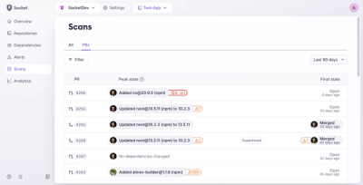
Socket’s new Pull Request Stories give security teams clear visibility into dependency risks and outcomes across scanned pull requests.

Research
/Security News
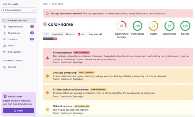
npm author Qix’s account was compromised, with malicious versions of popular packages like chalk-template, color-convert, and strip-ansi published.