Security News
Meet Socket at Black Hat and DEF CON 2025 in Las Vegas
Meet Socket at Black Hat & DEF CON 2025 for 1:1s, insider security talks at Allegiant Stadium, and a private dinner with top minds in software supply chain security.
react-native-button-component
Advanced tools
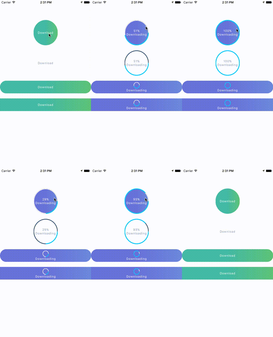
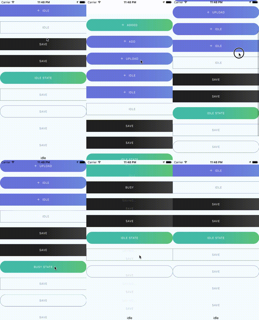
A Beautiful, Customizable React Native Button component for iOS & Android
React Native Button component for iOS & Android.


This library provided the following button components:
ButtonComponent
CircleButton
RoundButton
RectangleButton
CircleButton, RoundButton, RectangleButton is on top of ButtonComponent. So I recommend you should use CircleButton, RoundButton, RectangleButton, rather than directly use ButtonComponent because those button components may have preset some options.
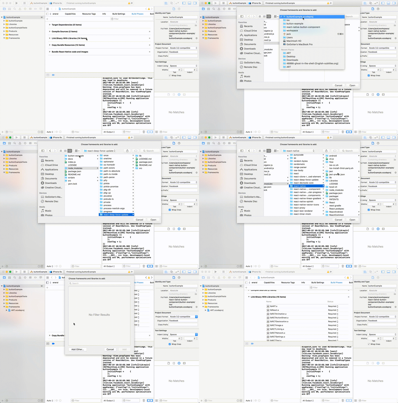
npm install --save react-native-button-componentreact-native linkIf you didn't see this item libART.a under the Link Binary With Libraries or you get this error No component found for view with name "ARTSurfaceView"
Please open Xcode project and add libART.a under Build Phases -> Link Binary With Libraries
+ button and Click Add Other...node_modules/react-native/Libraries/ART/ART.xcodeproj+ and select the libART.a and click Add

import ButtonComponent, { CircleButton, RoundButton, RectangleButton } from 'react-native-button-component';

// You can use CircleButton, RoundButton, RectangleButton to instead ButtonComponent
<ButtonComponent
  onPress={() => {}}
  image={require('button-image.png')}
  text="Button"
>
</ButtonComponent>
import ButtonComponent, { CircleButton, RoundButton, RectangleButton } from 'react-native-button-component';

// You can use CircleButton, RoundButton, RectangleButton to instead ButtonComponent
<ButtonComponent
  buttonState={this.state.buttonState} // "upload" or "uploading"
  states={{
    upload: {
      onPress: () => {
        this.imageUploader.upload();
        this.state.setState({ buttonState: 'uploading' });
      },
      image: require('upload-image.png'),
      text: 'Upload Image',
    },
    uploading: {
      onPress: () => {
        this.imageUploader.cancelUpload();
        this.state.setState({ buttonState: 'upload' });
      },
      spinner: true,
      text: 'Uploding Image...',
    },
  }}
>
</ButtonComponent>
<ButtonComponent
  text="Button"
  type="primary"
  shape="rectangle"
  backgroundColors={['#4DC7A4', '#66D37A']}
  gradientStart={{ x: 0.5, y: 1 }}
  gradientEnd={{ x: 1, y: 1 }}
  height={80}
  onPress={() => {}}
  image={require('button-image.png')}
>
</ButtonComponent>
import ButtonComponent, { CircleButton, RoundButton, RectangleButton } from 'react-native-button-component';

// You can use CircleButton, RoundButton, RectangleButton to instead ButtonComponent
<ButtonComponent
  buttonState={this.state.buttonState} // "upload" or "uploading"
  gradientStart={{ x: 0.5, y: 1 }}
  gradientEnd={{ x: 1, y: 1 }}
  states={{
    upload: {
      text: 'Upload Image',
      backgroundColors: ['#4DC7A4', '#66D37A'],
      image: require('upload-image.png'),
      onPress: () => {
        this.imageUploader.upload();
        this.state.setState({ buttonState: 'uploading' });
      },
    },
    uploading: {
      text: 'Uploding Image...',
      gradientStart: { x: 0.8, y: 1 },
      gradientEnd: { x: 1, y: 1 },
      backgroundColors: ['#ff4949', '#fe6060'],
      spinner: true,
      onPress: () => {
        this.imageUploader.cancelUpload();
        this.state.setState({ buttonState: 'upload' });
      },
    },
  }}
>
</ButtonComponent>
<ButtonComponent
  buttonState={this.state.buttonState} // "upload" or "uploading"
  gradientStart={{ x: 0.5, y: 1 }}
  gradientEnd={{ x: 1, y: 1 }}
  backgroundColors={['#4DC7A4', '#66D37A']}
  states={{
    upload: {
      text: 'Upload Image',
      image: require('upload-image.png'),
      onPress: () => {
        this.imageUploader.upload();
        this.state.setState({ buttonState: 'uploading' });
      },
    },
    uploading: {
      text: 'Uploding Image...',
      spinner: true,
      onPress: () => {
        this.imageUploader.cancelUpload();
        this.state.setState({ buttonState: 'upload' });
      },
    },
  }}
>
</ButtonComponent>
MIT
FAQs
Did you know?

Socket for GitHub automatically highlights issues in each pull request and monitors the health of all your open source dependencies. Discover the contents of your packages and block harmful activity before you install or update your dependencies.

Security News
Meet Socket at Black Hat & DEF CON 2025 for 1:1s, insider security talks at Allegiant Stadium, and a private dinner with top minds in software supply chain security.

Security News
CAI is a new open source AI framework that automates penetration testing tasks like scanning and exploitation up to 3,600× faster than humans.

Security News
Deno 2.4 brings back bundling, improves dependency updates and telemetry, and makes the runtime more practical for real-world JavaScript projects.