[](#contributors-)

React Native Navigation Drawer Extension


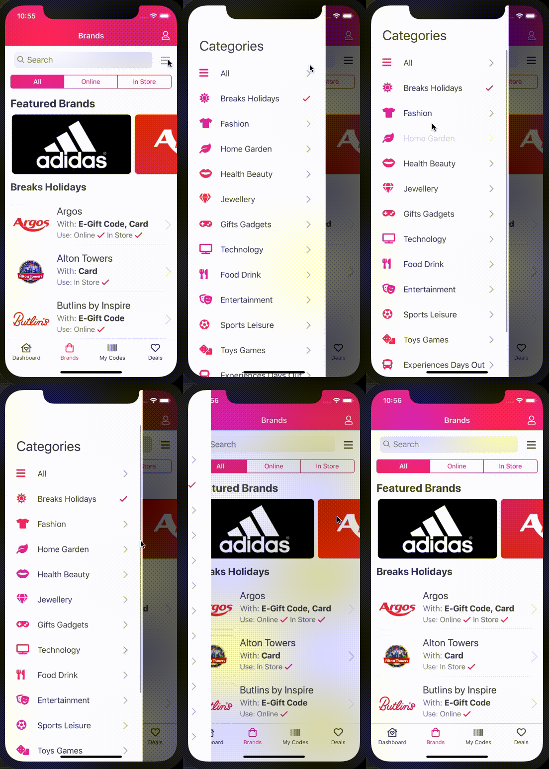
React Native Navigation by Wix does not offer an in-built solution for displaying a drawer on iOS. Their current side-menu has limited functionality on both iOS and Android. This is a drawer solution using showOverlay under the hood to display a drawer on iOS and Android.
If you are using React Native Navigation >= 3.0.0 then use version 3.x.x + of this library.


Install
npm install react-native-navigation-drawer-extension --save
or
yarn add react-native-navigation-drawer-extension
Usage
You need to register your drawer component with RNN. To do this use the register method and wrap your component in the RNNDrawer HOC.
import { Navigation } from "react-native-navigation";
import { RNNDrawer } from "react-native-navigation-drawer-extension";
Navigation.registerComponent("CustomDrawer", () => RNNDrawer.create(CustomDrawer));
You can then use the drawer by calling a custom method. The showDrawer method
will take a single parameter options identical to showOverlay.
import { RNNDrawer } from "react-native-navigation-drawer-extension";
RNNDrawer.showDrawer({
component: {
name: "CustomDrawer",
passProps: {
animationOpenTime: 300,
animationCloseTime: 300,
direction: "left",
dismissWhenTouchOutside: true,
fadeOpacity: 0.6,
drawerScreenWidth: "75%" || 445,
drawerScreenHeight: "100%" || 700,
style: {
backgroundColor: "red",
},
parentComponentId: props.componentId,
},
}
});
RNNDrawer.dismissDrawer();
To navigate from the drawer you must pass the parent componentId and use that to navigate. e.g:
Navigation.push(parentComponentId, {
component: {
name: "CustomScreenFromDrawer",
},
});
There's a complete and functional example at the example folder, with more thorough explanation on each method.
Props
The props below are used to configure the drawer and are to be used in RNN passProps:. Any aditional
props will be passed to your custom drawer component.
| Prop | Type | Optional | Default | Description |
|---|
| animationOpenTime | float | Yes | 300 | Time in milliseconds to execute the drawer opening animation. |
| animationCloseTime | float | Yes | 300 | Time in milliseconds to execute the drawer closing animation. |
| direction | string | Yes | left | Direction to open the collage, one of: ["left", "right", "top", "bottom"]. |
| dismissWhenTouchOutside | bool | Yes | true | Should the drawer be dismissed when a click is registered outside? |
| fadeOpacity | number | Yes | 0.6 | Opacity of the screen outside the drawer. |
| drawerScreenWidth | number/string | Yes | 80% | Width of drawer on portrait orientation. Pass a string containing '%' (e.g. "80%") for setting the width in relation to the screen or a number for absolute width (e.g. 300) |
| drawerScreenWidthOnLandscape | number/string | Yes | 30% | Width of drawer on landscape orientation. Pass a string containing '%' (e.g. "80%") for setting the width in relation to the screen or a number for absolute width (e.g. 300) |
| drawerScreenHeight | number/string | Yes | 100% | Height of drawer. Pass a string containing '%' (e.g. "30%") for setting the height in relation to the screen or a number for absolute height (e.g. 300) |
| disableDragging | boolean | Yes | false | Whether you want to disable dragging of the drawer. Useful if you have ScrollView inside the drawer (addresses #62). |
| disableSwiping | boolean | Yes | false | Whether you want to disable swiping gesture. Use it only in pair with disableDragging. |

The library also exposes a component which will allow you to open the drawer by either swiping the left or right gutter of the phone. This is achieved by using event listeners
to communicate with the RNNDrawer HOC component. To enable this feature wrap your screen with the SideMenuView component. <SideMenuView> is just an enhanced <View> all props are passed down to <View>.
import { SideMenuView } from "react-native-navigation-drawer-extension";

<SideMenuView
  style={{ flex: 1 }}
  drawerName={'CustomDrawer'}
  direction={'right'}
  passProps={{
    animationOpenTime: 300,
    animationCloseTime: 300,
    dismissWhenTouchOutside: true,
    fadeOpacity: 0.6,
    drawerScreenWidth: '75%',
    drawerScreenHeight: '100%',
    parentComponentId: props.componentId,
    style: {
      backgroundColor: 'white',
    },
  }}
  options={{
    layout: {
      componentBackgroundColor: 'transparent',
    }
 >
  {...}
 </SideMenuView>
Props
| Prop | Type | Optional | Default | Description |
|---|
| style | StyleProp | Yes | | The style of the drawer container. |
| drawerName | string | No | | The name of the drawer component. |
| direction | string | Yes | left | The direction to open the drawer, one of: ["left", "right"]. |
| passProps | object | Yes | | The values passed to the drawer. See props in RNNDrawer above. |
| options | Options | Yes | | The options to configure properties of the React Native Navigation native screen. Refer to React Native Navigation's options object. |
| swipeSensitivity | number | Yes | 0.2 | The sensitivity of the swipe to invoke each function. |
| sideMargin | number | Yes | 15 | The size of the gutter for both sides. |
| sideMarginLeft | number | Yes | | The size of the gutter for the left side. |
| sideMarginRight | number | Yes | | The size of the gutter for the right side. |
Contributors ✨

Thanks goes to these wonderful people (emoji key):
This project follows the all-contributors specification. Contributions of any kind welcome!


