reactjs-bottom-navigation
React bottom navigation component


Table of Contents
Introduction
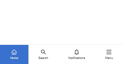
"ReactJS Bottom Navigation" is a lightweight and flexible component that provides a customizable bottom navigation experience for your React applications. This component has been fully re-implemented in TypeScript in version 2, providing a more robust and type-safe development experience. With a range of options to customize it.
Installation
npm install --save reactjs-bottom-navigation
Props
| Props | Type | Default | Description |
|---|
| items | BottomNavigationItem[] | - | The array of items to display in the navigation |
| selected | number | null | (optional) The index of the currently selected item |
| onItemClick | function | - | (optional) Triggered when an item is clicked, returns the clicked item |
| activeBgColor | string | - | (optional) Custom active background color code |
| activeTextColor | string | black | (optional) Custom active text color code |
| hideOnScroll | boolean | false | (optional) Hides the navigation bar when scrolling |
| style | React.CSSProperties | {} | (optional) Custom styles for the navigation container |
| className | string | "" | (optional) Custom class name for the navigation container |
Item Structure
All item properties are optional. If no property is provided, the item will occupy space but remain empty.
| Prop | Type | Description |
|---|
| title | string | (optional) Item title |
| icon | JSX.Element | (optional) Item icon |
| activeIcon | JSX.Element | (optional) Item active icon |
| onClick | function | (optional) Triggered when the item is clicked, returns the clicked item |
| render | ({ isActive: boolean; id: number }) => JSX.Element | (optional) Custom render function for the item |
| active | boolean | (optional) Custom active state control. If not provided, falls back to selected index behavior |
Usage
To use the component, provide an array of items representing the navigation options in the bar. Each item can include a title, an icon, or custom content using the render function.
Example:
import React, { useState } from "react";
import { BottomNavigation } from "reactjs-bottom-navigation";

function App() {
  const bottomNavItems = [
    {
      title: "Home",
      onClick: ({ id }) => alert("Menu clicked " + id),
      icon: <HomeIcon />,
      activeIcon: <HomeIcon color="#fff" />
    },
    {
      title: "Search",
    },
    {
      render: ({ isActive, id }) => isActive ? <strong>{id}</strong> : <span>{id}</span>,
    },
  ];

  return (
    <div>
      <BottomNavigation
        items={bottomNavItems}
        selected={0}
        onItemClick={(item) => console.log(item)}
        activeBgColor="slateBlue"
        activeTextColor="white"
        hideOnScroll={true}
        className="custom-bottom-nav"
        style={{ position: "fixed", bottom: 0, width: "100%" }}
      />
    </div>
  );
}

export default App;
Customization
The component offers multiple ways to customize:
Styles and Classes
- Navigation container:
bottom-nav - Navigation items:
bottom-nav-item - Item titles:
bottom-nav-item-title - Active items: Add
active class to bottom-nav-item
You can use activeBgColor, activeTextColor, and the className prop to further customize the appearance.
Hide on Scroll
Use the hideOnScroll prop to automatically hide the navigation bar when scrolling down.
Custom Content
Use the render method in items to define custom content for each navigation item.
License
MIT © hoseinhamzei


