Security News
vlt Launches "reproduce": A New Tool Challenging the Limits of Package Provenance
vlt's new "reproduce" tool verifies npm packages against their source code, outperforming traditional provenance adoption in the JavaScript ecosystem.
storybook-zeplin
Advanced tools
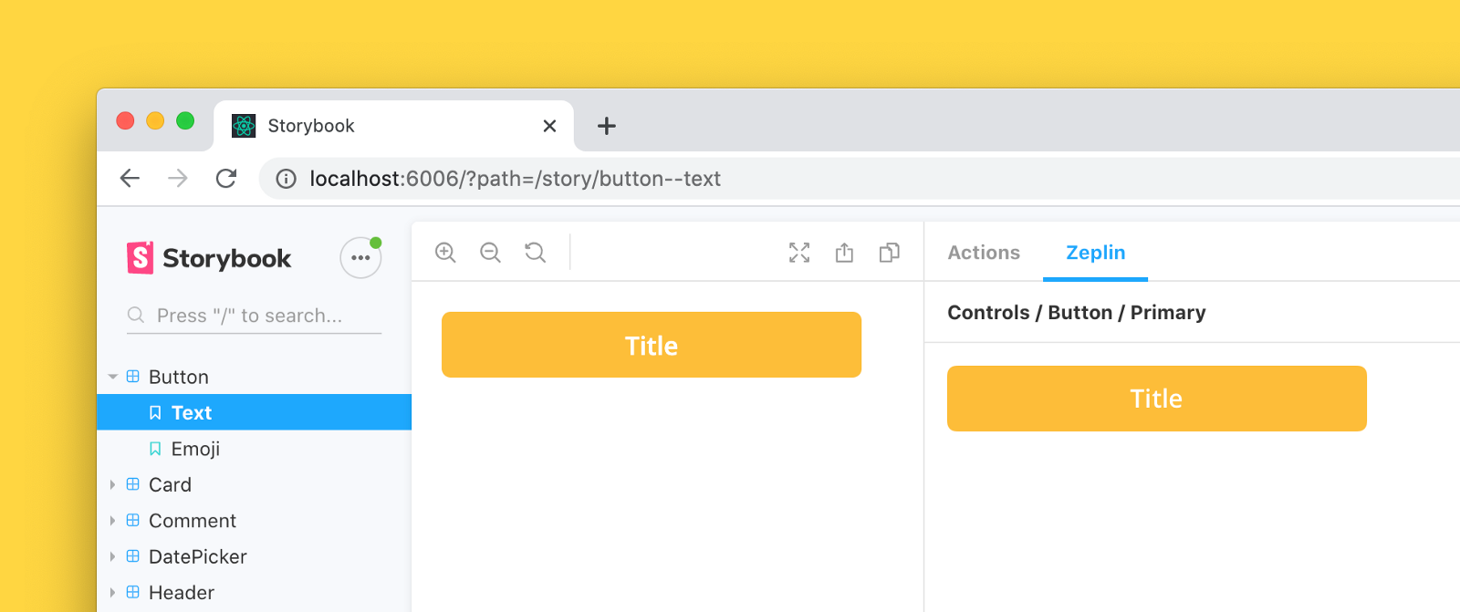
Storybook addon that embeds Zeplin resources such as screens and components in the addon panel for better design-development workflow.

Storybook Zeplin addon v3 is compatible with Storybook 8 and Node Version >18. For Storybook versions 5-7, please use Storybook Zeplin addon v2.0.3
For using Storybook 8:
npm install --save-dev storybook-zeplin
# yarn add -D storybook-zeplin
For using Storybook version 5-7:
npm install --save-dev storybook-zeplin@2.0.3
# yarn add -D storybook-zeplin@2.0.3
main.js// .storybook/main.js
module.exports = {
addons: ["storybook-zeplin/register"],
};
If you're using Storybook@5.0.x:
// .storybook/addons.js
import "storybook-zeplin/register";
There are two ways to do this, you can link your entire Zeplin project or styleguide to your global story parameters (recommended) or link individual components one by one.
Add zeplinLink to .storybook/preview.js file. This value is a link to the project or styleguide that contains correspondent designs in Zeplin as shown below examples.
When this parameter is provided, you will automatically view Zeplin components linked to your stories on the addon panel using the Storybook integration.
Using a Zeplin web link
//.storybook/preview.js
export const parameters = {
    zeplinLink: "https://app.zeplin.io/project/5e7a6d478204d59183a1c76b",
};
Using a Zeplin app link
//.storybook/preview.js
export const parameters = {
    zeplinLink: "zpl://project?pid=61f164b064e363a52fbb295f",
};
When the addon setup is done, go and check out below articles to learn more about how to initialize Storybook integration on Zeplin.
Storybook Zeplin takes parameter zeplinLink as an array of elements containing a name and a link or just a string for the link.
For the link, you can use full web URL or app URI of Zeplin components/screens.
Example of adding Zeplin link to all stories in a file:
export default {
    title: "Button",
    component: Button,
    parameters: {
        zeplinLink: "https://app.zeplin.io/project/5e7a6d478204d59183a1c76b/styleguide/components?coid=5eac833c5f1f2f1cb19f4f19",
    },
};

export const Default = () => <Button>Click me</Button>;
export const Secondary = () => <Button secondary>Click me</Button>;

Default.story = {
    name: "Primary Button",
};

Secondary.story = {
    name: "Secondary Button",
};
Example of adding multiple Zeplin links to a story:
export default {
    title: "Button",
    component: Button,
};

export const Default = () => <Button>Click me</Button>;
export const Secondary = () => <Button secondary>Click me</Button>;

Default.story = {
    name: "Responsive Button",
    parameters: {
        zeplinLink: [
            {
                name: "Desktop",
                link: "zpl://components?pid=pid1&coid=coid1",
            },
            {
                name: "Tablet",
                link: "zpl://components?pid=pid1&coid=coid2",
            },
            {
                name: "Mobile",
                link: "zpl://components?pid=pid1&coid=coid3",
            },
        ],
    },
};
To access your Zeplin resources, you need to provide an access token with your Zeplin account permissions. You can create one from Developer tab in your profile page.
The addon prompts to set the token when you open the addon's tab. This token is kept in the browser storage, so each user needs to create and set their own token to access Zeplin resources via Storybook.

If you want to skip creating tokens for each user,
you can provide the access token as an environment variable called STORYBOOK_ZEPLIN_TOKEN.
You can create .env file in your project's root folder, or you can provide the environment variable as a command line parameter when building or dynamically running Storybook.
Please note that access token can be viewed by anyone with access to the Storybook instance if you set it using environment variable. For security reasons, never use the environment variable, if the Storybook instance can be accessed by 3rd parties.
# .env
STORYBOOK_ZEPLIN_TOKEN="eyJhbGciOiJIUzI1N.."
Run following commands in separate tabs to start development
npm run watch
npm run storybook
MIT © Mert Kahyaoğlu
FAQs
Zeplin addon for Storybook
The npm package storybook-zeplin receives a total of 11,118 weekly downloads. As such, storybook-zeplin popularity was classified as popular.
We found that storybook-zeplin demonstrated a healthy version release cadence and project activity because the last version was released less than a year ago. It has 0 open source maintainers collaborating on the project.
Did you know?

Socket for GitHub automatically highlights issues in each pull request and monitors the health of all your open source dependencies. Discover the contents of your packages and block harmful activity before you install or update your dependencies.

Security News
vlt's new "reproduce" tool verifies npm packages against their source code, outperforming traditional provenance adoption in the JavaScript ecosystem.

Research
Security News
Socket researchers uncovered a malicious PyPI package exploiting Deezer’s API to enable coordinated music piracy through API abuse and C2 server control.

Research
The Socket Research Team discovered a malicious npm package, '@ton-wallet/create', stealing cryptocurrency wallet keys from developers and users in the TON ecosystem.