
v-wave
The material-ripple directive for Vue that actually works


Also available for React: use-wave
Why did I make this?
Because every ripple plugin I've tried to use in the past either didn't work or was missing basic features.
Here's what you can expect from this plugin:
- It works (see for yourself).
- The wave appears on
pointerdown instead of pointerup
(you might think that's an obvious choice... but you'd be wrong). - There is a small delay before the ripple appears, during which the animation will be canceled if the user moves the pointer (e.g. scrolling on a mobile phone). This is similar to how native Android ripples work.
- Uses CSS transforms instead of
width and height. - Doesn't affect the appearance of the element you apply it to (won't explode when used on an element with
display: flex). - Guesses the color of the wave automatically by default (using
currentColor). - Works with fixed, absolute, relative, and statically positioned elements.
- Will handle independent border-radii (e.g.
border-radius: 5px 20px 15px 30px) perfectly fine.
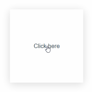
Quick start
After installing and registering the plugin, this is all you need to get started:
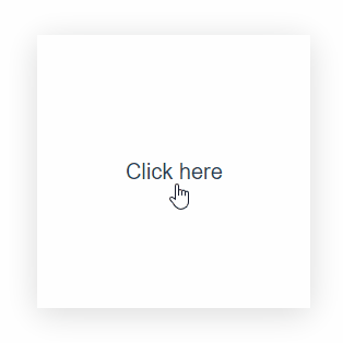
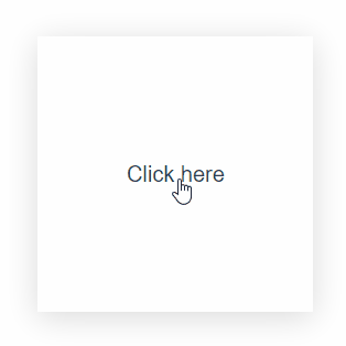
<button v-wave>Click here</button>
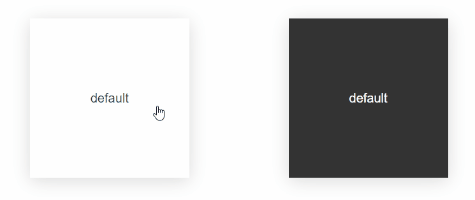
Out of the box, this will provide you with a ripple that matches the text color of the element it has been applied to, with reasonable defaults for a responsive feeling ripple.
You can change the look and feel of the ripple on a per-element basis, or by modifying the global defaults.
Contents
Installation
See: npm, cdn
Via NPM
See: Vue, Nuxt
$ npm i v-wave
Vue
import { createApp } from 'vue'
import VWave from 'v-wave'
import App from './App.vue'

const app = createApp(App)

app.use(VWave)
Vue 2
import Vue from 'vue'
import VWave from 'v-wave'
Vue.use(VWave)
or
Nuxt
export default {
modules: ['v-wave/nuxt']
}
Via CDN
Expand examples
<script src="https://unpkg.com/v-wave"></script>
Vue.use(VWave)
Configuration
See: configuring globally, configuring locally
Configuring globally
See: Vue, Nuxt
Vue
import { createApp } from 'vue'
import VWave from 'v-wave'
import App from './App.vue'

const app = createApp(App)

app.use(VWave, {
    color: 'red',
    initialOpacity: 0.5,
    easing: 'ease-in',
})
Vue 2
import Vue from 'vue'
import VWave from 'v-wave'
Vue.use(VWave, {
color: 'red',
initialOpacity: 0.5,
easing: 'ease-in',
})
or
Nuxt
export default {
modules: ['v-wave/nuxt'],
vWave: {
color: 'red',
initialOpacity: 0.5,
easing: 'ease-in',
}
}
Configuring locally
<button v-wave="{
    color: 'red',
    initialOpacity: 0.5,
    easing: 'ease-in',
}">
Click here
</button>
Options
See: summary, details
Summary
Details
color
Sets the background of the ripple.
Supports any value that the CSS background property does.
Expand examples
See: color, gradient, image
Simple color
<button v-wave="{
    color: 'red',
}">
Click here
</button>

Gradient
<button v-wave="{
    color: 'radial-gradient(closest-side, #fff, #00f, #fff)',
}">
Click here
</button>
Image
<button v-wave="{
    color: 'no-repeat url(https://...) 0 0 / cover',
}">
Click here
</button>
initialOpacity
The opacity of the ripple when it first appears.
Expand examples
See: initialOpacity: 1, initialOpacity: 0
initialOpacity of 1
<button v-wave="{
    initialOpacity: 1,
}">
Click here
</button>
initialOpacity of 0
<button v-wave="{
    initialOpacity: 0,
}">
Click here
</button>

finalOpacity
The opacity the ripple should be when it has stopped moving.
Expand examples
See: finalOpacity: 1, finalOpacity: 0
finalOpacity of 1
<button v-wave="{
    finalOpacity: 1,
}">
Click here
</button>
finalOpacity of 0
<button v-wave="{
    finalOpacity: 0,
}">
Click here
</button>

duration
- type:
number (seconds) - default:
0.4
The duration of the ripple in seconds.
The total duration is duration + dissolveDuration
Expand example
duration of 3 seconds
<button v-wave="{
    duration: 3,
}">
Click here
</button>
dissolveDuration
- type:
number (seconds) - default:
0.15
The duration of the "dissolve animation" in seconds.
This is the fade-out animation that plays once the wave has reached its maximum size.
The total duration is duration + dissolveDuration
Expand example
dissolve duration of 3 seconds
<button v-wave="{
    dissolveDuration: 3,
}">
Click here
</button>

easing
Any valid CSS <easing-function> (see more)
Expand example
cubic-bezier
<button v-wave="{
    easing: 'cubic-bezier(0,.57,.89,0)',
}">
Click here
</button>

cancellationPeriod
- type:
number (milliseconds) - default:
75
The delay, in milliseconds, during which the animation will be canceled if the user moves their figure/pointer (e.g. while scrolling on a mobile device).
Note: The ripple will not appear until after the delay. This means a delay greater than 100ms can feel sluggish.
trigger
- type:
"auto" | string | boolean - default:
"auto"
Sets the behavior of the wave when used with triggers. (See the dedication section on triggers for more details).
-
false
Disables the use of triggers. If a v-wave-trigger (without an ID) is present in the dom tree of this element, it will be ignored (i.e. v-wave always behaves as if there's no trigger).
-
true
Requires a trigger to activate the ripple. v-wave assumes the presence of a v-wave-trigger (without an ID) in its dom tree. The ripple will only activate for pointerdown events on the trigger element.
-
"auto"
If a v-wave-trigger (without an ID) is present in the dom-tree of the v-wave element, it behaves as trigger: true, otherwise it behaves as trigger: false.
-
string
Any string other than "auto" will be treated as an ID. v-wave will only activate when a v-wave-trigger with a matching ID receives a pointerdown event.
This is different from the other values as it allows you to place the trigger element anywhere in the dom, while the others require the trigger to be a descendant.
Expand example
basic trigger
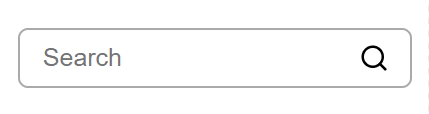
<label v-wave>
<input type="text" placeholder="Search" />
<img v-wave-trigger src="search.svg" />
</label>
tagName
- type:
string - default:
"div"
Sets the tag name of the element used as the wave container. This is is useful in scenarios where the default div may interfere with :last-of-type or similar selectors.
Using triggers
Triggers allow you to activate a wave on an element when, and only when, a different element receives input.
In the following example, the wave will only activate for the label element when the user clicks or taps on the <img/>.
<label v-wave>
    <span>Password</span>
    <input :type="showPassword ? 'text' : 'password'" />
    <img v-wave-trigger src="eye.svg" @click="() => showPassword = !showPassword" />
</label>
In this next example, clicking one of the buttons will activate the wave on the other button.
<button v-wave="{trigger: 'button2'}" v-wave-trigger:button1>Button 1</button>

<button v-wave="{trigger: 'button1'}" v-wave-trigger:button2>Button 2</button>
Triggers that use an ID support many-to-many relationships. See the grid example on the example page.
Disabling the directive
If you need to temporarily disable the wave effect, simply pass false to the directive.
Note that v-wave checks for strict false equality (=== false).
Using any other falsely value will not disable the directive.
<button v-wave="false">Click me!</button>
Advanced
Registering the directive locally
Local registration with Composition API:
<script>
import VWave from 'v-wave'
const { vWave, vWaveTrigger } = VWave.createLocalWaveDirective({})
</script>
<template>
<button v-wave>Click me!</button>
</template>
Local registration with Options API:
<script>
import VWave from 'v-wave'
const { wave, waveTrigger } = VWave.createLocalWaveDirective({})
export default {
directives: {
wave,
waveTrigger
}
}
</script>
<template>
<button v-wave>Click me!</button>
</template>
Vue 2
If you are using Vue 2, you need to pass "vue2" as the second argument to createLocalWaveDirective
<script>
import VWave from 'v-wave'
const { wave, waveTrigger } = VWave.createLocalWaveDirective({}, 'vue2')
export default {
directives: {
wave,
waveTrigger
}
}
</script>
<template>
<button v-wave>Click me!</button>
</template>
Changing the directive's name
If you are migrating from another ripple directive you can change the name of the directive v-wave uses if you want to avoid changing it in your source code.
Simply pass a new name for the directive using the directive option:
import Vue from 'vue'
import VWave from 'v-wave'
Vue.use(VWave, {
directive: 'ripple'
})
Now you can use the plugin like so:
<button v-ripple>Click me!</button>
Keep in mind that this option can only be set globally (i.e. it cannot be set on individual directives).
License
This project is distributed under the MIT License.
The MIT License (MIT)
Copyright (c) 2021 Justin Taddei
Permission is hereby granted, free of charge, to any person obtaining a copy of this software and associated documentation files (the "Software"), to deal in the Software without restriction, including without limitation the rights to use, copy, modify, merge, publish, distribute, sublicense, and/or sell copies of the Software, and to permit persons to whom the Software is furnished to do so, subject to the following conditions:
The above copyright notice and this permission notice shall be included in all copies or substantial portions of the Software.
THE SOFTWARE IS PROVIDED "AS IS", WITHOUT WARRANTY OF ANY KIND, EXPRESS OR IMPLIED, INCLUDING BUT NOT LIMITED TO THE WARRANTIES OF MERCHANTABILITY, FITNESS FOR A PARTICULAR PURPOSE AND NONINFRINGEMENT. IN NO EVENT SHALL THE AUTHORS OR COPYRIGHT HOLDERS BE LIABLE FOR ANY CLAIM, DAMAGES OR OTHER LIABILITY, WHETHER IN AN ACTION OF CONTRACT, TORT OR OTHERWISE, ARISING FROM, OUT OF OR IN CONNECTION WITH THE SOFTWARE OR THE USE OR OTHER DEALINGS IN THE SOFTWARE.


