Realogy Shared Components
This library contains the following components and features that can be included in Realogy products:
Migration Guide
Migrating to version 1.1:
- To hide the hamburger menu across all view ports add hide-hamburger-btn='true' attribute to rsc-header.
Migrating to version 1:
- The package is now available in es5 and and es2015 specifications.
- The index files are now available at
@abt-desk/rsc/lib/es5 and @abt-desk/rsc/lib/es2015 for es5 and es2015 respectively. - Components are packaged separately, to use the components import the components in the script separately.
Example:
import "@abt-desk/rsc/lib/es5/header";
import "@abt-desk/rsc/lib/es2015/header";
Changelog
We'll keep track of each release in the CHANGELOG
Installation
npm install @abt-desk/rsc
Integrating into a project
Using webpack (option A)
Working with webpack, you can import the library into your main file.
import "@abt-desk/rsc/lib/polyfills";
import "@abt-desk/rsc/lib/es2015";
import "@abt-desk/rsc/lib/styles.css";
Using embedded script (option B)
Copy the lib folder under your public directory.
<script type="text/javascript" src="public/rsc/lib/polyfills.js"></script>
<script type="text/javascript" src="public/rsc/lib/es2015/index.js"></script>
<link rel="stylesheet" href="public/rsc/lib/styles.css" />
Usage
Include any or all of the components as a regular html tag where they'd logically reside within your HTML structure. For example, you might include the header near the top of the body:
<rsc-header></rsc-header>
Usage to display any additional content
Include the components as a regular html tag with any additional content you wanted to display as below, example:
(The additional content which is passed by a consuming application may or may not be optional)
Example:
<rsc-advanced-footer>
  <span>Licensed under CC BY 4.0.<span/>
</rsc-advanced-footer>
Important: It's necessary to enclose your main content into a wrapper with an specific class and pass it to the header component as main-class, It makes the menus work correctly on mobile view ports.
React Example
import React, { Component } from "react";
import "@abt-desk/rsc/lib/polyfills";
import "@abt-desk/rsc/lib/es2015/header";
import "@abt-desk/rsc/lib/es2015/footer";
import "@abt-desk/rsc/lib/es2015";
import "@abt-desk/rsc/lib/styles.css";

import "./App.css";

class App extends Component {
  constructor(props) {
    super(props);
  }

  componentDidMount() {
    const rscClient = window.__RSC__;
    rscClient.setMenuItem({
      name: "My Profile",
      url: "www.google.com",
      icon: "far fa-user",
      target: "_blank",
    });
    rscClient.setMenuItem({
      name: "Reset Dashboard Layout",
      url: "www.github.com",
      icon: "fal fa-repeat-alt",
      target: "_blank",
    });
    rscClient.setMenuItem({
      name: "Settings",
      url: "www.google.com",
      icon: "fal fa-cog",
      target: "_blank",
    });
    rscClient.setMenuItem({
      name: "Log Out",
      url: "www.github.com",
      icon: "fal fa-sign-out-alt",
      target: "_blank",
    });
  }

  render() {
    return (
      <div className="App">
        <rsc-header
          app-key="84bbb33a-27b6-4c6d-b965-242e9a101ec3"
          brand-key="85440"
          username="Sergey"
          main-class="main"
          user-photo="http://www.iconarchive.com/download/i60042/mattahan/ultrabuuf/Comics-Spiderman-Morales.ico"
          okta-id="00uhcgfrmyEIAef7R0h7"
          service-url="https://general.url"
          apps-service-url="https://applications.url"
          avatar-service-url="https://dev-avatar.mycbdesk.com"
        ></rsc-header>
        <div className="main">
          <h1>Sample React App</h1>
          <p>
            Lorem Ipsum is simply dummy text of the printing and typesetting
            industry. Lorem Ipsum has been the industry's standard dummy text
            ever since the 1500s, when an unknown printer took a galley of type
            and scrambled it to make a type specimen book. It has survived not
            only five centuries, but also the leap into electronic typesetting,
            remaining essentially unchanged. It was popularized in the 1960s
            with the release of Letraset sheets containing Lorem Ipsum passages,
            and more recently with desktop publishing software like Aldus
            PageMaker including versions of Lorem Ipsum.
          </p>
        </div>
        <rsc-footer></rsc-footer>
      </div>
    );
  }
}

export default App;
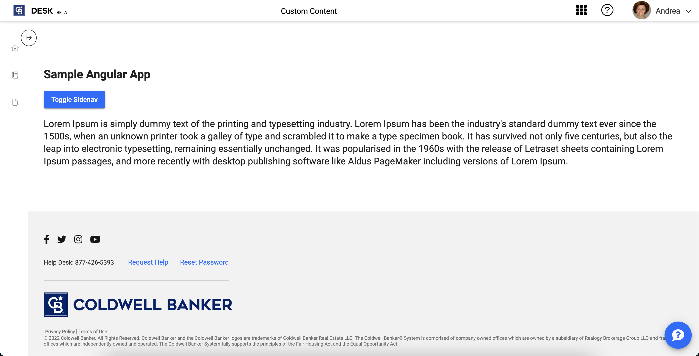
Angular Example
Import the css on the main style file of angular
src/app/styles.scss.
@import '@abt-desk/rsc/lib/styles.css';
Import the polyfills on the polyfills file of angular
src/app/polyfills.ts.
import "@abt-desk/rsc/lib/polyfills";
Add the assets in angular json
"assets": [
  ...
  {
    "input": "./node_modules/@abt-desk/rsc/lib/assets/rsc-icons",
    "glob": "**/*",
    "output": "/assets/rsc-icons/"
  }
],
Enable custom elements on your angular module adding the CUSTOM_ELEMENTS_SCHEMA to the schemas
import { BrowserModule } from "@angular/platform-browser";
import { NgModule, CUSTOM_ELEMENTS_SCHEMA } from "@angular/core";

import { AppComponent } from "./app.component";

@NgModule({
  declarations: [AppComponent],
  imports: [BrowserModule],
  providers: [],
  bootstrap: [AppComponent],
  schemas: [CUSTOM_ELEMENTS_SCHEMA],
})
export class AppModule {}
Import the components in the main file
import { Component, OnInit, AfterViewInit, AfterViewChecked, NgZone } from '@angular/core';
import '@abt-desk/rsc/lib/es2015/header';
import '@abt-desk/rsc/lib/es2015/footer';
import '@abt-desk/rsc/lib/es2015';

function _window(): any {
  return window;
}

@Component({
  selector: 'app-root',
  templateUrl: './app.component.html',
  styleUrls: ['./app.component.scss']
})
export class AppComponent implements OnInit, AfterViewInit, AfterViewChecked {
  constructor(private ngZone: NgZone) {

  }
  title = 'angular-integration-test';
  public mounted = false;
  public isSetMenu = false;

  ngOnInit() {
    this.ngZone.run(() => this.mounted = true);
  }

  ngAfterViewInit() {
    const rscClient =  _window().__RSC__;
    if (rscClient && !this.isSetMenu) {
      rscClient.setMenuItem({ name: 'My Profile', url: 'www.google.com', icon: 'far fa-user', target: '_blank'});
      rscClient.setMenuItem({ name: 'Reset Dashboard Layout', url: 'www.github.com', icon: 'fal fa-repeat-alt', target: '_blank'});
      rscClient.setMenuItem({ name: 'Settings', url: 'www.google.com', icon: 'fal fa-cog', target: '_blank'});
      rscClient.setMenuItem({ name: 'Log Out', url: 'www.github.com', icon: 'fal fa-sign-out-alt', target: '_blank'});
      this.isSetMenu = true;
    }
  }
}
Template
<rsc-header
*ngIf="mounted"
app-key="84bbb33a-27b6-4c6d-b965-242e9a101ec3"
brand-key="85440"
username="Sergey"
main-class="main"
user-photo="http://www.iconarchive.com/download/i60042/mattahan/ultrabuuf/Comics-Spiderman-Morales.ico"
okta-id="00uhcgfrmyEIAef7R0h7"
service-url="https://general.url"
apps-service-url="https://applications.url"
avatar-service-url="https://dev-avatar.mycbdesk.com"
>
</rsc-header>
<div class="main">
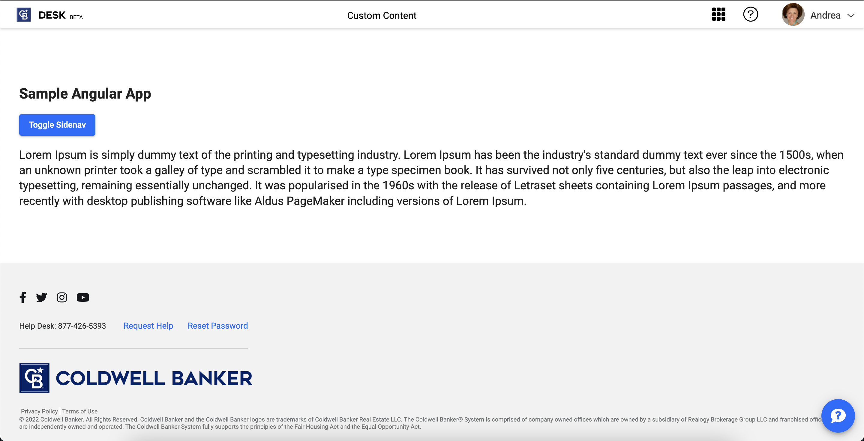
<h1>Sample Angular App</h1>
<p>
Lorem Ipsum is simply dummy text of the printing and typesetting industry.
Lorem Ipsum has been the industry's standard dummy text ever since the
1500s, when an unknown printer took a galley of type and scrambled it to
make a type specimen book. It has survived not only five centuries, but also
the leap into electronic typesetting, remaining essentially unchanged. It
was popularized in the 1960s with the release of Letraset sheets containing
Lorem Ipsum passages, and more recently with desktop publishing software
like Aldus PageMaker including versions of Lorem Ipsum.
</p>
</div>
<rsc-footer *ngIf="mounted"></rsc-footer>
Note: Ensure to mount the header and footer once your Angular component was mounted. Notice the mounted variable, then the client library will be available.
Plain Web Page Example
<html lang="en">
  <head>
    <meta charset="utf-8" />
    <title>Sample</title>
    <base href="/" />
    <meta http-equiv="x-ua-compatible" content="IE=edge" />
    <meta name="viewport" content="width=device-width, initial-scale=1" />
    <script type="text/javascript" src="public/rsc/lib/polyfills.js"></script>
    <script src="public/rsc/lib/es2015/header.js"></script>
    <script src="public/rsc/lib/es2015/footer.js"></script>
    <script src="public/rsc/lib/es2015/index.js" async></script>
    <link rel="stylesheet" href="public/rsc/lib/styles.css" />
  </head>
  <body>
    <rsc-header
      app-key="84bbb33a-27b6-4c6d-b965-242e9a101ec3"
      brand-key="85440"
      username="Sergey"
      user-photo="http://www.iconarchive.com/download/i60042/mattahan/ultrabuuf/Comics-Spiderman-Morales.ico"
      okta-id="00uhcgfrmyEIAef7R0h7"
      service-url="https://general.url"
      apps-service-url="https://applications.url"
      avatar-service-url="https://dev-avatar.mycbdesk.com"
    >
    </rsc-header>
    <div className="main">
      <h1>Sample Plain Web Page</h1>
      <p>
        Lorem Ipsum is simply dummy text of the printing and typesetting
        industry. Lorem Ipsum has been the industry's standard dummy text ever
        since the 1500s, when an unknown printer took a galley of type and
        scrambled it to make a type specimen book. It has survived not only five
        centuries, but also the leap into electronic typesetting, remaining
        essentially unchanged. It was popularized in the 1960s with the release
        of Letraset sheets containing Lorem Ipsum passages, and more recently
        with desktop publishing software like Aldus PageMaker including versions
        of Lorem Ipsum.
      </p>
    </div>
    <rsc-footer></rsc-footer>
    <script>
      var rscClient = window.__RSC__;
      rscClient.setMenuItem({
        name: "My Profile",
        url: "www.google.com",
        icon: "far fa-user",
        target: "_blank",
      });
      rscClient.setMenuItem({
        name: "Reset Dashboard Layout",
        url: "www.github.com",
        icon: "fal fa-repeat-alt",
        target: "_blank",
      });
      rscClient.setMenuItem({
        name: "Settings",
        url: "www.google.com",
        icon: "fal fa-cog",
        target: "_blank",
      });
      rscClient.setMenuItem({
        name: "Log Out",
        url: "www.github.com",
        icon: "fal fa-sign-out-alt",
        target: "_blank",
      });
    </script>
  </body>
</html>
Client library
With the library exposed, there is additional functionality to interact with the component. Get the rscService as following:
const rscClient = window.__RSC__;
'rscServiceInit' event is emitted after rsc is ready.
Theming
A theme can be added globally by two ways
- By adding a brand key using rsc-client API
setGlobalTheme (recommended method).
setGlobalTheme |
|---|
| takes brand key as a parameter |
| parameters |
| brandKey: string |
rscClient.setGlobalTheme("<brandKey>");
- By adding a brand key to the body element as shown below
<body data-rsc-brand-key="<brand-key>">
  ...application template
</body>
There are 3 css variables that are available that holds the primary, accent and warn colors for the current theme.
Variable names:
- --rsc-primary
- --rsc-accent
- --rsc-warn
Example:
.body {
  color: var(--rsc-primary);
}
Import:
import "@abt-desk/rsc/lib/es5/header";
import "@abt-desk/rsc/lib/es2015/header";
Selector: <rsc-header></rsc-header>
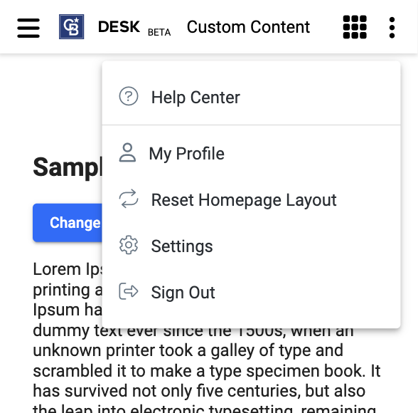
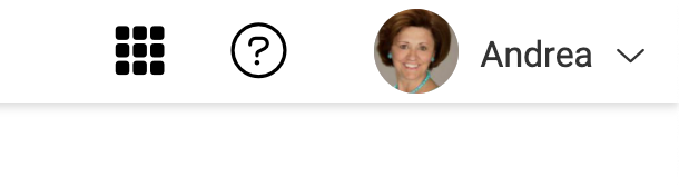
The header is composed of three main features:
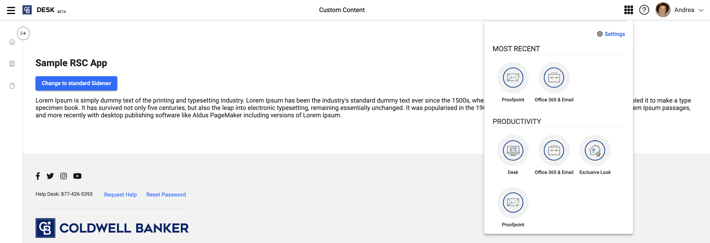
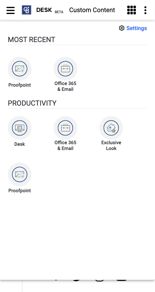
- Waffle Menu
- Notifications (upcoming feature)
- Profile Menu
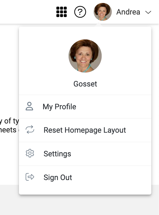
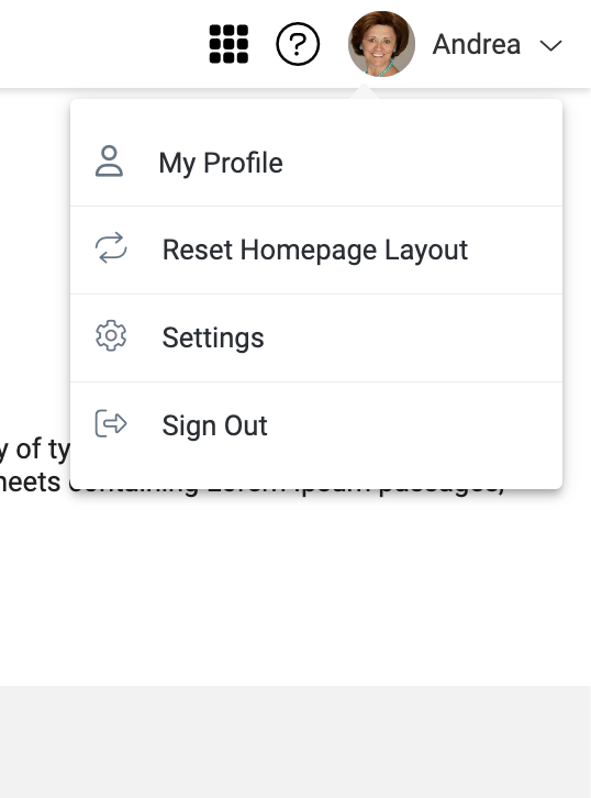
The Waffle Menu is a set of applications available to the user, so they may more easily access different tools in their product suite, no matter which they may currently be using. The applications can be grouped by category, with an additional set including the most recently accessed by the current user. Do not add extra margins for the waffle menu items that might broken down the title of the waffle menu items.
Notifications are product and company specific notices available within an application that are appropriate in context of the application, rather than an alternative such as email or a push notification. They include unread, read and archived states - as well as an index of all received notifications for future reference.
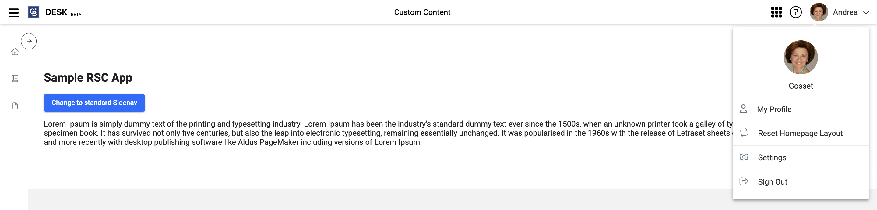
The Profile Menu is meant to contain all user related links and actions that aren't appropriate for other forms of navigation, such as a tree structure.
This might include the ability to log out of an application, linking to view or edit one's profile, or edit a user's application specific settings and preferences.
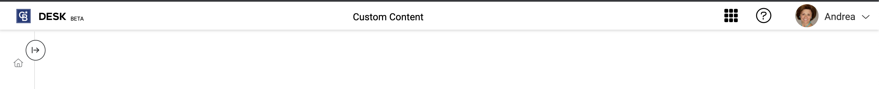
| Header with all content for mobile | Header with minimum content for mobile |
|---|
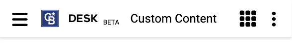 |  |
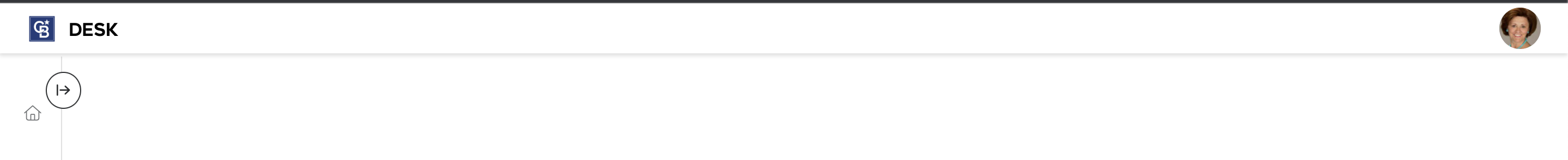
| User menu for mobile | Waffle menu for mobile |
|---|
 |  |
The header component receives the following properties:
| Attribute | Description |
|---|
| app-key (required) | Key of the application |
| brand-key | Key of the brand, if not added default brand will be set |
| username | Username that appears on the header and profile menu |
| user-photo | User photo that appears on the header and profile menu |
| main-class | Body's class name to show and hide body when needed |
| okta-id | Okta Id to retrieve the photo to display on the header |
| service-url | Is is the API from where RSC gets the brand and application information from (default: https://rsc.realogy.com) |
| avatar-service-url | It is the API where the photo of the person logged in will be fetched from (default: https://avatar.mycbdesk.com) |
| apps-service-url | It is the API where the waffle information is fetched from (default: https://backend.mycbdesk.com) |
| full-width-layout | Header/Footer full screen width: true or false (default: false) |
| header-size-update | To increase the header size along with components in it: true or false (default: false) |
| profile-menu | profile menu appears on the header and turn off legacy hamburger menu: true or false (default: true) |
| external-privacy-policy-path | url for privacy policy link in the footer |
| external-terms-of-service-path | url for terms of service link in the footer |
| hide-hamburger-btn (boolean) | enables and disables the hamburger button (default: true above viewport 992px and false for less) |
Example:
  <rsc-header
    app-key="<app key>"
    brand-key="<brand key>"
    username="<user name>"
    user-photo="https://image.test"
    service-url="https://general.url"
    apps-service-url="https://applications.url"
    main-class="main"
    okta-id="<okta id>"
    avatar-service-url="https://dev-avatar.mycbdesk.com"
  />
    // Here you can add you custom component
    <my-custom-component></my-custom-component>
  </rsc-header>
To make the header sticky add the following styles
<header style="position: fixed; width: 100%; top: 0;">
  <rsc-header></rsc-header>
</header>
The header component receives the following methods:
Set Okta Id
setOktaId |
|---|
| takes okta id as the parameter and sets oktaId in rsc |
| parameters |
| url: string |
Example:
rscClient.setOktaId(<oktaId>);
Set Access Token
setAccessToken |
|---|
| sets oktaId in rsc to retrieve apps |
| parameters |
| token: string - access token |
Example:
rscClient.setAccessToken(<token>);
Set Help Docs Url
setHelpDocsUrl |
|---|
| URL to help documentation, if provided help button will appear in the header. |
| parameters |
| url: string - url for help doc |
Example:
rscClient.setHelpDocsUrl(<url>);
Set User
setUser |
|---|
| set user information |
| parameters |
| user: User - object containing details of the user |
Example:
rscClient.setUser({
  username: "name",
  userPhoto: "https://image.test",
  oktaId: "jh123h1j3hj213j4",
});
Set Username
setUsername |
|---|
| sets a username |
| parameters |
| username: string |
Example:
rscClient.setUsername(<username>);
Set User First Name
setUserFirstName |
|---|
| set a user first name |
| parameters |
| userFirstName: string |
Example:
rscClient.setUserFirstName(<userFirstName>);
showProfileInUserMenu |
|---|
| set boolean to show or hide the photo on the user menu |
| parameters |
| showProfileInUserMenu: boolean |
Example:
rscClient.showProfileInUserMenu(true);
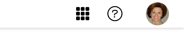
| With profile in menu | Without profile in menu |
|---|
 |  |
Set User Photo
setUserPhoto |
|---|
| set a user photo by url (e.g. https://image.sergey), set boolean to show or hide the photo on the user menu |
| parameters |
| userPhoto: string, showProfileInUserMenu: boolean |
Example:
rscClient.setUserPhoto(<url>);
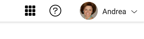
Show User Name In Topnav
showUserNameInTopnav |
|---|
| set boolean to show or hide the first username on the topnav |
| parameters |
| showUserNameInTopnav: boolean |
Example:
rscClient.showUserNameInTopnav(true);
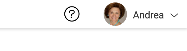
| With user name | Without user name |
|---|
 | 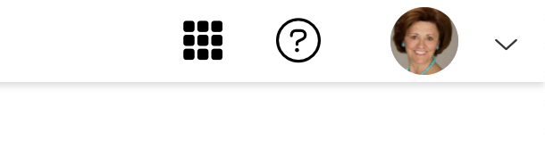 |
Show Caret Down Icon In Topnav
showCaretDownIconInTopnav |
|---|
| set boolean to show or hide the caret indicator in header near the username in Topnav |
| parameters |
| showCaretDownIconInTopnav: boolean |
Example:
rscClient.showCaretDownIconInTopnav(true);
| With caret down icon | Without caret down icon |
|---|
 |  |
Show Beta Indicator
showBetaIndicator |
|---|
| set boolean to show or hide the "beta" indicator in header |
| parameters |
| showBetaIndicator: boolean |
Example:
rscClient.showBetaIndicator(true);
| With beta indicator | Without beta indicator |
|---|
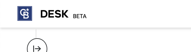 | 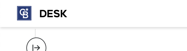 |
showWaffleMenu |
|---|
| set boolean to show or hide the "waffleMenu" indicator in header - default value is true. |
| parameters |
| showWaffleMenu: boolean |
Example:
rscClient.showWaffleMenu(false);
| With waffle menu | Without waffle menu |
|---|
 |  |
Set Home Button Callback
setHomeButtonCallback |
|---|
| set a home button callback function, which will be called, when a user clicks on the header logo/app name. |
| parameters |
| callback: function |
Example:
rsc.setHomeButtonCallback(function () {
  console.log("redirecting to home...");
});
setMenuItem |
|---|
| set additional item to the profile menu |
| parameters |
| menuItem: menu |
Example:
rscClient.setMenuItem({ name: <name>, url: <url>, icon: <icon>, target: <target> });
removeMenuItem |
|---|
| removes an specific menu item by name |
| parameters |
| name: string |
Example:
rsc.removeMenuItem("name of the menu item");
setMenu |
|---|
| An array of items to set the menu. |
| parameters |
| menuItems: Array<menu> |
Example:
rsc.setMenu([
  { name: <name>, url: <url>, icon: <icon>, target: <target> },
  { name: <name>, url: <url>, icon: <icon>, target: <target> }
]);
Hamburger button toggled
rscHamburgerBtnToggled |
|---|
| emitted when the hamburger button is clicked or touched |
Example:
const headerEl = document.getElementsByTagName("rsc-header")[0];
headerEl.addEventListener("rscHamburgerBtnToggled", () => {
});
| property | type | required | description |
|---|
| name | string | | link text |
| url | string | | target url |
| icon | string | | fontawesome class icon, e.g. 'fa-times' (see https://fontawesome.com/v6.0/icons) |
| onTab | boolean | | set true to open in a new tab, default false |
| callback | function | | target callback function (optional, if not provided url will be used) |
| weight | int | | menu items are sorted in ascending order. (default: 0) |
| showTooltip | boolean | | to show the material tooltip. (default: false) |
| tooltipText | string | | content to be shown in the tooltip |
| tooltipClass | string | | custom class to be added in tooltip, if needed. |
| tooltipPosition | string | | set position of tooltip. (default: below) |
User
| property | type | required | description |
|---|
| username | string | | set username |
| userPhoto | string | | set a user photo by url (e.g. https://image.sergey) |
| oktaId | string | | set oktaId |
Import:
import "@abt-desk/rsc/lib/es5/footer";
import "@abt-desk/rsc/lib/es2015/footer";
selector: <rsc-footer></rsc-footer>
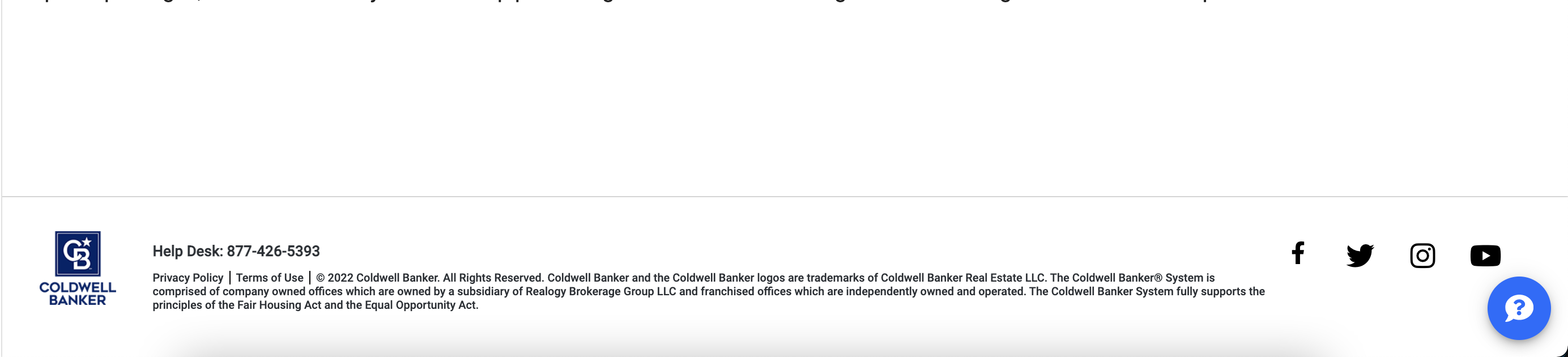
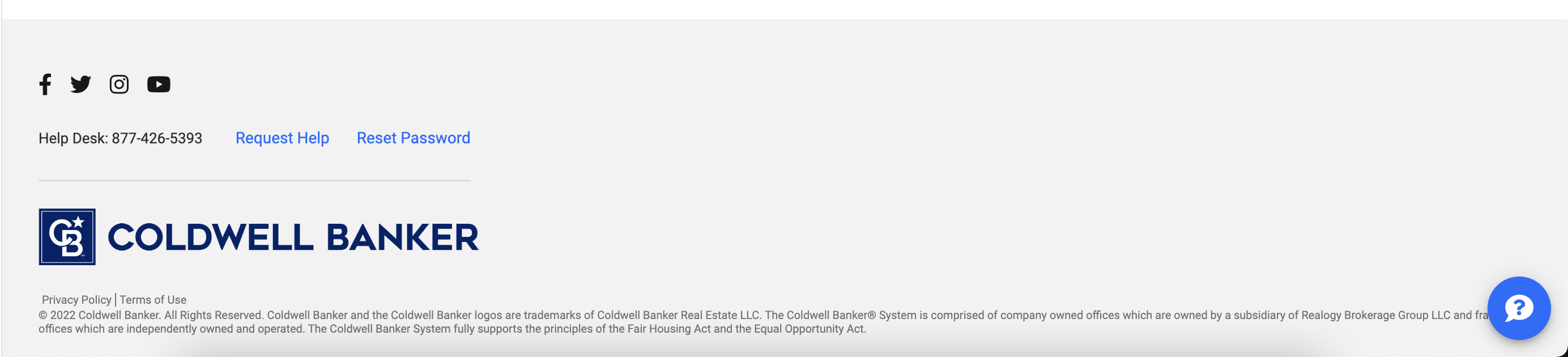
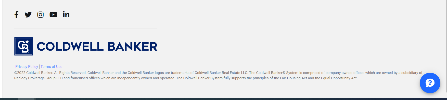
The footer component should include standard elements, such as legal information, links to privacy policies, sitemaps, terms of use and company branding and social media links (represented as icons).
Include the components as a regular html tag with any additional content you wanted to display as below, example:
(The additional content which is passed by consuming application is optional)
Example:
<rsc-footer *ngIf="mounted">
  <span>It is licensed under CC BY 4.0.</span>
</rsc-footer>
Note: Footer component needs the header component to be mounted
Import:
import "@abt-desk/rsc/lib/es5/advanced-footer";
import "@abt-desk/rsc/lib/es2015/advanced-footer";
Selector: <rsc-advanced-footer></rsc-advanced-footer>
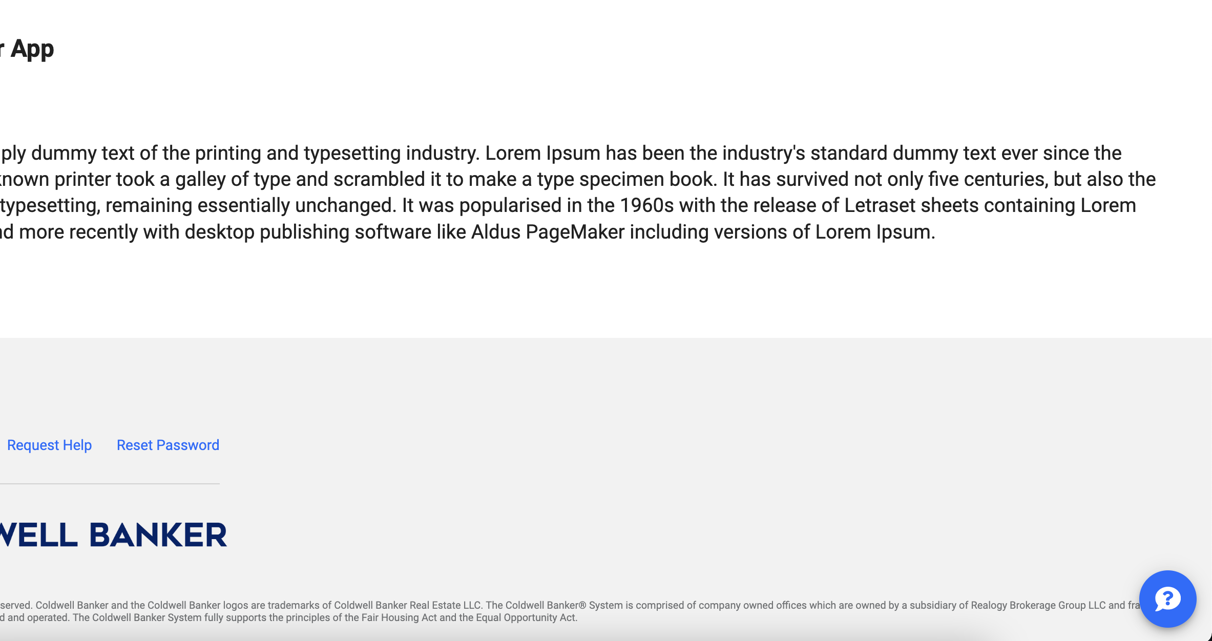
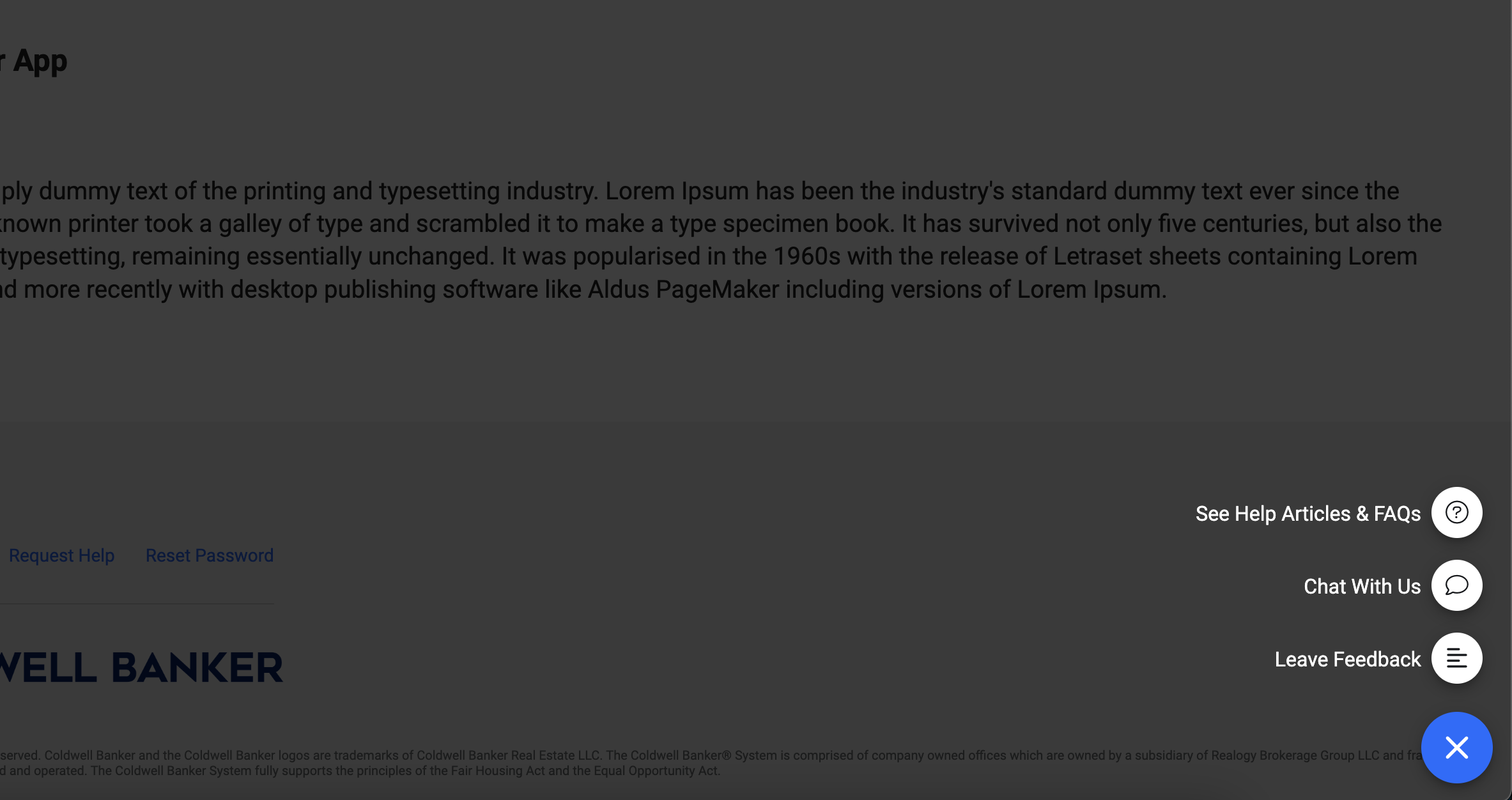
The advanced footer component should include standard elements, such as legal information, links to privacy policies, sitemaps, terms of use and company branding and social media links (represented as icons) similar to the standard footer plus links to service now and user settings.
Include the components as a regular html tag with any additional content you wanted to display as below, example:
(The additional content which is passed by consuming application is optional)
The advanced footer component receives the following properties:
| Attribute | Description |
|---|
| hide-help-desk-resources | If true it will hide the help desk resources in advanced footer (default: false) |
Example:
<rsc-advanced-footer hide-help-desk-resources="false">
  <span>It is licensed under CC BY 4.0.</span>
</rsc-advanced-footer>
Note: Advanced footer component needs the header component to be mounted
Speed Dial
Import:
import "@abt-desk/rsc/lib/es5/advanced-footer";
import "@abt-desk/rsc/lib/es2015/advanced-footer";
Selector: <rsc-speed-dial></rsc-speed-dial>
Overview of Speed Dial
The speed dial (alternately referred to as a floating action button, or FAB) would be used when you have a set of actions you'd like to make persistently available to users.
The speed dial is presented as a triggering floating action button, anchored to the bottom right of the screen. It will follow users when scrolling. When clicked, an overlay and its constituent child actions will appear.
Each child action should relate to a more broad concept. For example, an additive action, represented as a plus, might contain the ability to add listings, contacts or documents.
Speed dials should contain no more than 6 child actions.
Include the components as a regular html tag and add any of the attributes mentioned below to modify the component.
To replace the default icon with a custom image or content add content inside the rsc-speed-dial tag as shown below.
If side nav is being used, then place the speed dial element outside the side nav element.
<rsc-side-nav></rsc-side-nav>
<rsc-speed-dial>
<img src="path/to/img"></img>
</rsc-speed-dial>
Options for this component can be set using the methods mentioned below
The main button color can be changed by overriding the 'fab-toggler' class as shown below:
.rsc-speed-dial .fab-toggler {
  background-color: <brand color>;
}
Speed Dial UI
| Speed dial closed | Speed dial open |
|---|
 |  |
APIs of Speed Dial
Attributes of Speed Dial
| Attribute | Description |
|---|
| fab-icon (optional) | font awesome class name, default: support fab icon will be displayed. |
| brand-key (optional) | a theme is applied on the component based on the Brand key, overrides the global theme |
| mat-color (optional) | sets the theme palette, default: accent |
Example:
<rsc-speed-dial fab-icon="far fa-align-left"> </rsc-speed-dial>
Methods for Speed Dial
Set a single speed dial
setSpeedDialOption |
|---|
| this method is used to set speed dial options individually |
| parameters |
| option: speedDialOption - object containing details of the option |
Example:
rscClient.setSpeedDialOption({
name: "Leave Feedback",
icon: "fal fa-comment-exclamation",
weight: 2,
url: "https://www.mycbdesk.com/feedback",
target: "_blank",
});
rscClient.setSpeedDialOption({
name: "See Help Articles & FAQs",
icon: "fal fa-question-circle",
callback: function (option) {
window.open("https://www.mycbdesk.com/help-center", "_blank");
},
});
Remove an option
removeSpeedDialOption |
|---|
| removes one speed dial option based on the name |
| parameters |
| name: string - name of the option |
Example:
rscClient.removeSpeedDialOption("Leave Feedback");
Set multiple speed dial options
setSpeedDial |
|---|
| this method adds the speed dial options passed to the method, all previous options will be replaced |
| parameters |
| speedDialOptions: Array<speedDialOption> - collection of speed dial options |
Example:
rscClient.setSpeedDial([
  {
    name: "Leave Feedback",
    icon: "far fa-align-left",
    weight: 2,
    url: "https://www.mycbdesk.com/feedback",
    target: "_blank",
  },
  {
    name: "See Help Articles & FAQs",
    icon: "fal fa-question-circle",
    url: "https://www.mycbdesk.com/help-center",
  },
]);
Speed Dial Interfaces
Speed Dial Option
| property | type | required | description |
|---|
| name | string | yes | option name |
| url | string | no | target url |
| icon | string | yes | font-awesome class icon, e.g. 'fa-times' (see https://fontawesome.com/v6.0/icons) |
| weight | int | no | options are sorted in ascending order (lowest weight is displayed at the top, default: 0) |
| target | string | no | sets target value, (default: '_blank)' |
| callback | function | no | an optional property, the call back function is called every time an option is clicked |
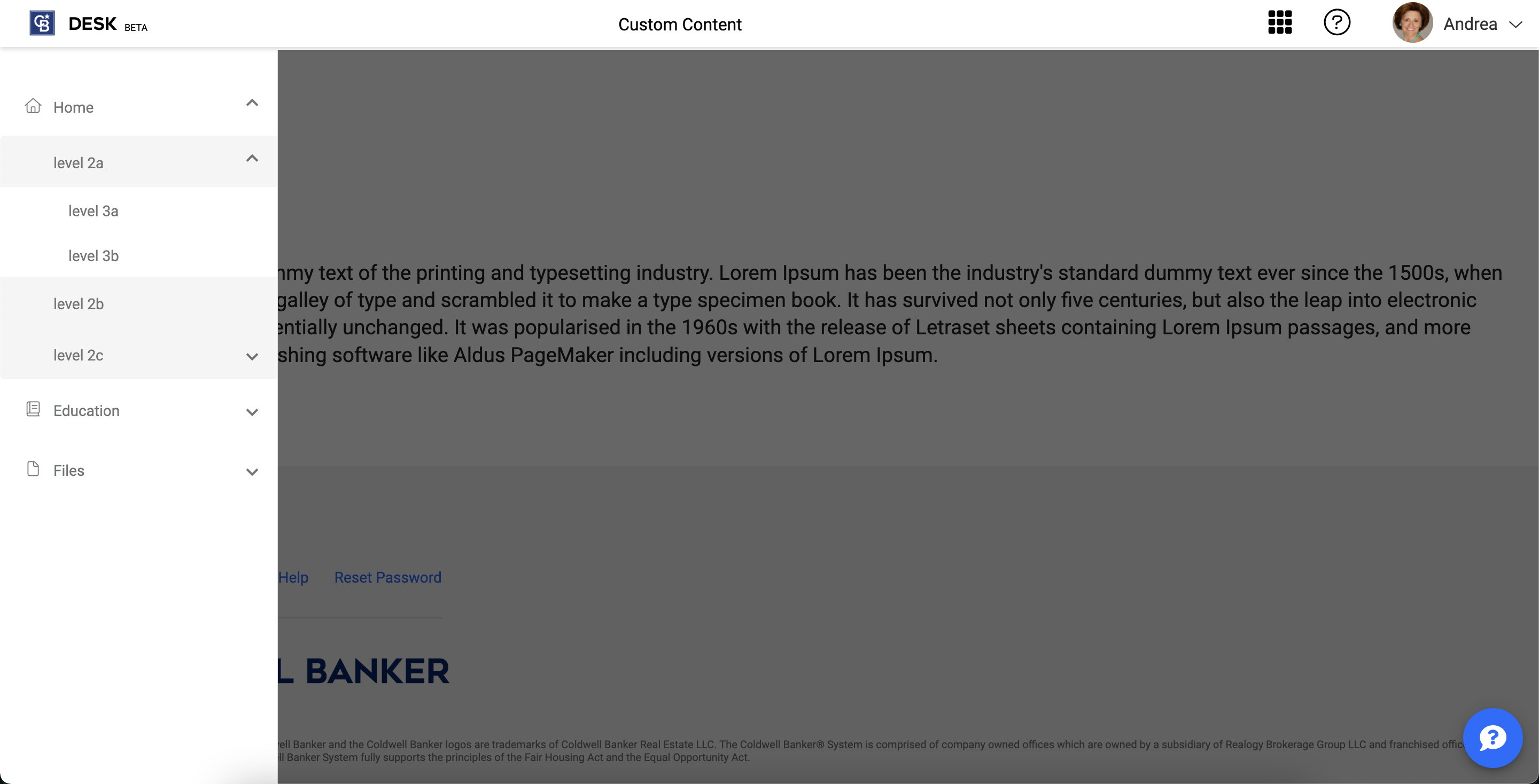
Side Nav
Import:
import "@abt-desk/rsc/lib/es5/side-nav";
import "@abt-desk/rsc/lib/es2015/side-nav";
Selector: <rsc-side-nav></rsc-side-nav>
Overview for Side Nav
The SideNav may be used in applications where content is organized in a tree structure. In the case of this component, this should be limited to applications where the content hierarchy includes 2-3 levels of navigation. More focused task-oriented applications aren't appropriate, but content heavy applications such as intranets should be able to leverage the component to quickly organize content in a way consistent with other products across the organization.
Implementation:
Place the main content of the application inside the side nav element. Ideally header component will be placed above the side nav element and offset height to equal the height of the header.
Set the sidenav config based on the type of device or as required for pages as shown below.
If you'd like to allow users on desktops the convenience of collapsing and expanding the sidenav to provide more room for content, ensure that enableStaggeredNav is set to true.
If speed dial is being used, then place the speed dial element outside the side nav element.
Example:
<header></header>
<rsc-side-nav offset-height="45px">
  <main><main>
</rsc-side-nav>
<rsc-speed-dial></rsc-speed-dial>
For Angular applications add the 'mounted' flag on rsc-side-nav element.
Check 'mounted' flag implementation here
<rsc-side-nav offset-height="45px" *ngIf="mounted === true">
</rsc-side-nav>
To set active state on the nav item the nav items must have an URL and the whenever the route changes, the current route should be pushed to rsc by calling setCurrentUrl method. Active state will be set only when the nav item URL and the current URL matches.
Other side nav states can be controlled by calling the setSidenavState method.
Side nav UI
Staggered side nav
| Side nav collapsed | Side nav expanded |
|---|
 | 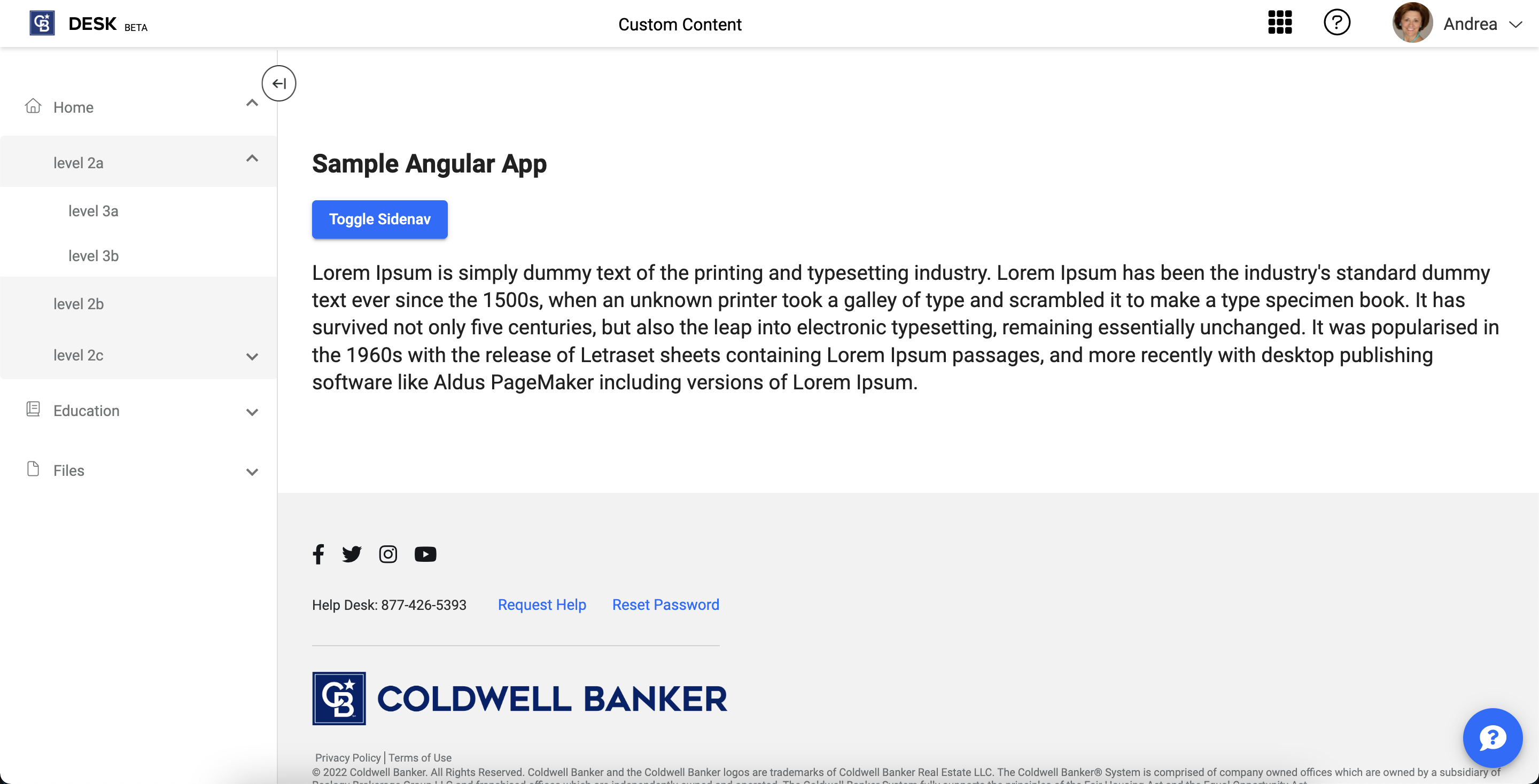 |
Standard side nav
| Side nav collapsed | Side nav expanded |
|---|
 |  |
APIs for Side Nav
Attributes of Side Nav
| Attribute | Description |
|---|
| offset-height (optional) | the height of the side nav is calculated by subtracting the offset height from 100vh |
Example:
<rsc-side-nav offset-height="45px"></rsc-side-nav>
Methods for Side Nav
Update side nav state
setSidenavState |
|---|
| updates the state of the side nav, properties can be set separately |
| parameters |
| sidenavState: SidenavState - contains properties that change the state of the side nav |
Example:
rscClient.setSidenavState({
state: "closed",
});
if (widow.innerWidth <= 992) {
rscClient.setSidenavState({
enableCache: false,
enableStaggeredNav: false,
state: "closed",
hasBackdrop: true,
});
}
if (widow.innerWidth > 992) {
rscClient.setSidenavState({
enableCache: true,
enableStaggeredNav: true,
state: "closed",
hasBackdrop: false,
});
}
Add a nav item
setSidenavItem |
|---|
| this method is used to add a single nav item |
| parameters |
| sidenavItem: SidenavItem - object containing details of the side nav item |
Example:
rscClient.setSidenavItem({
icon: 'fal fa-book',
label: 'Education',
showAnchorTag: true,
url: '/test',
openInNewTab: boolean,
childItems: [
{
label: 'level1',
showAnchorTag: true,
url: 'level1.com',
openInNewTab: false,
}
],
});
rscClient.setSidenavItem(
{
icon: 'fal fa-book',
label: 'Education',
url: 'https://www.mycbdesk.com/help-center',
callback: function(option) {window.open('https://www.mycbdesk.com/help-center', '_blank')},
childItems: [
{
label: 'level1',
showAnchorTag: true,
url: 'level1.com',
openInNewTab: false,
}
],
};
Remove a navigation item
removeSidenavItem |
|---|
| removes one navigation item based on the name, applicable for the first level (removes all child items) |
| parameters |
| label: string - label of the navigation item |
Example:
rscClient.removeSidenavItem("Education");
Set multiple sidenav items
setSidenav |
|---|
| this method adds the navigation items passed to the method, all previous items will be replaced |
| parameters |
| sidenavItems: Array<SidenavItem> - collection of navigation items |
Example:
rscClient.setSidenav([
{
icon: "fal fa-home",
label: "Desk",
url: "/",
callback: () => {
},
childItems: [
{
label: "level2",
url: "/level2",
callback: () => {
},
childItems: [
{
label: "level3",
showAnchorTag: true,
url: "level3.com",
openInNewTab: true,
childItems: [],
},
],
},
{
label: "level21",
url: "/level21",
callback: () => {
},
childItems: [],
},
],
},
{
icon: "fal fa-book",
label: "Education",
url: "/education",
callback: () => {
},
childItems: [],
},
]);
Update current url
setCurrentUrl |
|---|
| updates the current url of the parent application |
| parameters |
| currentUrl: string |
Example:
rscClient.setCurrentUrl("mycbdesk.com");
rscClient.setCurrentUrl("/company");
Toggle sidenav open state
toggleSidenavOpenState |
|---|
| updates the current url of the parent application |
Example:
rscClient.toggleSidenavOpenState();
Events for Side Nav
Sidenav closed
rscSidenavClosed |
|---|
| emitted when the sidenav is closed |
Example:
const sidenavEl = document.getElementsByTagName("rsc-side-nav")[0];
sidenavEl.addEventListener("rscSidenavClosed", () => {
});
Sidenav opened
rscSidenavOpened |
|---|
| emitted when the sidenav is opened |
Example:
const sidenavEl = document.getElementsByTagName("rsc-side-nav")[0];
sidenavEl.addEventListener("rscSidenavOpened", () => {
});
Side Nav Interfaces
Sidenav State
| property | type | required | description |
|---|
| state | string | no | available values: 'closed', 'open', if 'enableStaggeredNav' is true then the close state will display the navigation icons, default: 'closed' |
| hasBackdrop | boolean | no | if true adds a overlay over the content when the nav bar is open |
| collapseAll | boolean | no | collapses all the nav items |
| enableStaggeredNav | boolean | no | true will enable the staggered side nav, default: true |
| offsetHeight | string | no | sets the height of the container where the side nav and the content is rendered, overrides the value passed as the attribute 'offset-height' |
| enableCache | boolean | no | this flag allows the states to persist on the browser, only applicable for 'closed' state if enableStaggeredNav is enabled and 'open' state, default: true |
| disableHover | boolean | no | this flag disables the hover effect in the staggered version of the sidenav, default: false |
Sidenav Item
| property | type | required | description |
|---|
| label | string | yes | the name displayed on the side nav |
| icon | string | no | the icon displayed beside the label, only applicable for the 1st level, fontawesome class icon, e.g. 'fa-times' (see https://fontawesome.com/v6.0/icons) |
| showAnchorTag | boolean | no | if true an anchor tag is added to the DOM with url as the href (default is false) |
| url | string | no | used as href if anchor tag is enabled and used to set the active state |
| openInNewTab | boolean | no | if true adds target='_blank' attribute to the anchor tag (default is false) |
| callback | function | no | executes custom code when option is clicked/touched |
| panelState | string | no | determines if the nav item is expanded or collapsed, possible values 'expanded' and 'collapsed' (default is collapsed) |
| childItems | Array<SidenavItem> | no | contains child nav items, applicable for level one and two |
| isActive | boolean | no | sets the active class on the nav item, set o true when the current url and nav item url is same |
| collapseAll | boolean | no | collapses all the nav items |
Constants
Brand keys
| Brand | Key |
|---|
| Coldwellbanker | cb |
| Coldwellbanker commercial | cbc |
| Realogy products | rp |
| Realogy | rlgy |
| Century 21 | c21 |
| Better Homes and Gardens | bhg |
| ERA Real Estate | era |
| ZIP Realty | zip |
| Sotheby's International Realty | sir |
| Corcoran | cor |
Theme palettes
| Palettes | primary, accent and warn |
|---|


