React Scatter Graph


A fully customizable, ready to use scatter graph UI package for React.
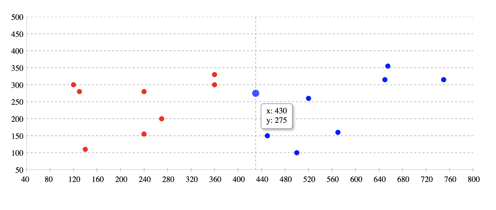
Try tweaking React Scatter Graph using this codesandbox link here
Installation
npm install @keyvaluesystems/react-scatter-graph
You’ll need to install React separately since it isn't included in the package.
Usage
React Scatter Graph can run in a very basic mode like this:
import React, { useState } from 'react';
import ReactScatterGraph from '@keyvaluesystems/react-scatter-graph';

function App() {
  data = [
    { x: 450, y: 150 },
    { x: 360, y: 330 },
    { x: 650, y: 315 },
    { x: 270, y: 200 }
  ];

  return <ScatterGraph data={data} graphHeight={500} />;
}

export default App;
The data array is an array of objects with { x, y } coordinates.
Note: The graph width is responsive. So it can be adjusted by a parent wrapper. You need to provide the height.
React Scatter Graph for date inputs:
Scatter graph is a useful tool for plotting date values. In order to do so, timestamps must be provided for the x-axis values.
import React, { useState } from 'react';
import ReactScatterGraph from '@keyvaluesystems/react-scatter-graph';
function App() {
data = [
{ x: 1672876800000, y: 150 },
{ x: 1673568000000, y: 330 },
{ x: 1674086400000, y: 315 },
{ x: 1673222400000, y: 200 }
];
return <ScatterGraph data={data} graphHeight={500} />;
}
export default App;
v2.0.0 (Major Version Change)
This release includes a breaking change. Please read this document carefully before upgrading
Breaking Changes
- The
axisColor prop has been renamed to gridLineColor.
Migration Steps
- Update Prop: Replace the prop
axisColor with the name gridLineColor.
Before
<ScatterGraph data={data} graphHeight={500} axisColor='#00FF00' />
After
<ScatterGraph data={data} graphHeight={500} gridLineColor='#00FF00' />
Props
Props that can be passed to the component are listed below:
| Prop | Description | Default |
|---|
data: object[] | An array of x-y coordinates to render. | undefined |
graphHeight: number | Height of graph in pixel | undefined |
gridLineColor: string | Color for the grid lines on the x and y axes. It helps user to see the exact value of a point on the graph | #9E9E9E |
originAxisColor: string | Color for the origin axis | #9E9E9E |
renderYLabel?: (arg: number | string): string |
Render function for customizing Y axis label
| undefined |
renderXLabel?: (arg: number | string): string |
Render function for customizing X axis label
| undefined |
scatterPointColor?: (arg: { x: number, y: number }): string |
Function for customizing scatter point color. Based on the args, we can customise the color. Return value should be the color hash / string.
| undefined |
renderValuebox?: (x: number, y: number): ReactElement |
Render function for customizing the value box shown on hover.
| undefined |
styles?: object | Provides you with a bunch of style objects and callback functions to override the default styles.(refer
Style Customizations)
| undefined |
Style Customizations
Style customizations can be done by overriding default styles using the styles prop.
The below code shows all the overridable styles using styles prop.
<ScatterGraph
  data={data}
  graphHeight={500}
  styles={{
    Root?: {...styles},
    XLabel?: (xLabel) => ({...styles}),
    YLabel?: (yLabel) => ({...styles}),
  }}
/>;
For a more specific example, please refer the following:
<ScatterGraph
  data={data}
  graphHeight={500}
  styles={{
    Root: {
      marginTop: 50
    },
    XLabel: () => ({
      color: 'blue'
    }),
    YLabel: () => ({
      color: 'green'
    })
  }}
/>
Within the styles prop, following keys accept a style object:
Root - overrides the style of outermost container.
Within the styles prop, following keys accept a function that returns the desired style for each element:
XLabel - overrides the style of x-axis labels.YLabel - overrides the style of y-axis labels.