Angular Hover Gradient Button
The Angular Hover Gradient Button is a customizable, easy-to-use Angular button with a hover gradient effect on hover.
Features
- Customizable background color and hover color.
- Support for icons on the left or right side of the button's label.
- Flexible and easy-to-use with dynamic content.
Installation
To install the Angular Hover Gradient Button in your project, you can run the following command:
npm install angular-hover-gradient-button
Usage
First, import AngularHoverGradientButton in your Angular module or component:
import { AngularHoverGradientButton } from "angular-hover-gradient-button";

@NgModule({
  declarations: [AppComponent],
  imports: [BrowserModule, AngularHoverGradientButton],
  bootstrap: [AppComponent],
})
export class AppModule {}
Then, you can use the angular-hover-gradient-button component in your templates:
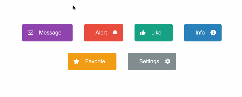
<angular-hover-gradient-button backgroundColor="#8e44ad" hoverColor="#3498db">
  <i slot="left" class="fa-regular fa-envelope"></i>
  <span slot="label">Message</span>
</angular-hover-gradient-button>
Icons
The angular-hover-gradient-button component supports positioning of icon display using the slot attribute.
Slot Attribute
The slot attribute determines the position of the icon within the button. There are two options for slot:
left: Positions the icon on the left side of the button.right: Positions the icon on the right side of the button.
Example usage:
<i class="fa fa-icon-name" slot="left"></i>
<i class="fa fa-icon-name" slot="right"></i>
Inputs
| Input | Description | Type | Default Value |
|---|
backgroundColor | Background color of the button. | String | '#1e3799' |
hoverColor | Color of the progress bar. | String | '#78e08f' |
Styling
The component supports customization through CSS variables. You can override the following variables to customize the appearance:
angular-hover-gradient-button {
  --button-color: white;
  --button-padding: 1em;
  --button-border-radius: 5px;
  --button-border: none;
  --button-font-size: 1.2em;
}
Contributing
Contributions are welcome! Please open an issue or submit a pull request with your improvements.
License
This project is licensed under the ISC License.


