Security News
vlt Launches "reproduce": A New Tool Challenging the Limits of Package Provenance
vlt's new "reproduce" tool verifies npm packages against their source code, outperforming traditional provenance adoption in the JavaScript ecosystem.
bulma-toast
Advanced tools
Bulma's pure JavaScript extension to display toasts. Basically a Bulma's notification implemented as a toast plugin.

The plugin comes with 5 options to be used as a JavaScript object:
message: The actual message to be displayed. It can be a string, a template string, or a DOM node. See examples.type: Essentially a Bulma's css class. It can be is-primary, is-link, is-info, is-success, is-warning, is-danger, or any other custom class. Default is a whitesmoke background with dark text as shown here.duration: Duration of the notification in milliseconds. Default is 2000 milliseconds.position: Position where the notification will be shown. The default is top-right, so if you want it to be on the top-left just add top-left to this option. The available options are: top-left, top-center, top-right, center, bottom-left, bottom-center, and bottom-right.dismissible: Whether the notification will have a close button or not. Default is false.pauseOnHover: Pauses delay when hovering the notification. Default is false.closeOnClick: Dismisses the notification when clicked. Default is true.opacity: The notification's container opacity. Default is 1.animate: See here. Default is no animations. npm install --save bulma-toast
<script src="bulma-toast.min.js"></script>
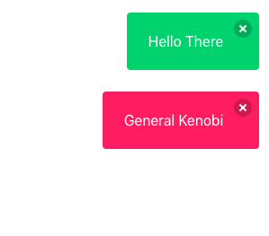
bulmaToast.toast({ message: "Hello There" });
bulmaToast.toast({ message: "General Kenobi", type: "is-danger" });
bulmaToast.setDoc(window.document);
This can be changed before each toast call and can be set to eny element.
// Import the toast function
import * as bulmaToast from "bulma-toast";
// Or use
// import { toast as superToast } from 'bulma-toast'
// to rename your import

toast({
  message: "Hello There",
  type: "is-success",
  dismissible: true,
  animate: { in: "fadeIn", out: "fadeOut" }
});
A simple default object to prevent errors. Your options will be merged with these and the defaults will be used if the fields are not provided.
  {
    message: "Your message here",
    duration: 2000,
    position: "top-right",
    closeOnClick: true,
    opacity: 1
  }
Bulma Toast supports animate.css (and maybe others?). You MUST include animate.css on your document's <head>
  <head>
    <link rel="stylesheet" href="animate.min.css">
    <!-- or -->
    <link rel="stylesheet" href="https://cdn.jsdelivr.net/npm/animate.css@3.5.2/animate.min.css">
    <!-- or -->
    <link rel="stylesheet" href="https://cdnjs.cloudflare.com/ajax/libs/animate.css/3.5.2/animate.min.css">
  </head>
Accepts a object with in and out with css classes to add animations. Using Animate.css you would pass a object like this:
  {
    message: "I'm animated! Yay!",
    duration: 2000,
    position: "top-right",
    animate: { in: 'fadeIn', out: 'fadeOut' }
  }
Warning: Don't use opacity when using animations. Some of them use the opacity property like fade in and fade out.
import { toast } from "bulma-toast";

toast({
  message: "Hello There",
  type: "is-success",
  dismissible: true,
  pauseOnHover: true
});

toast({
  message: "<h1>LOOK HERE</h1>",
  type: "is-danger",
  dismissible: true,
  pauseOnHover: true,
  animate: { in: "fadeIn", out: "fadeOut" }
});

const myMessage = `It's ${new Date().toDateString()}`;

toast({
  message: myMessage,
  type: "is-primary",
  position: "center",
  closeOnClick: true,
  pauseOnHover: true,
  opacity: 0.8
});

const elm = document.createElement("a");
elm.text = "Visit my website!";
elm.href = "https://rfoel.com";

toast({
  message: elm,
  type: "is-warning",
  position: "center",
  closeOnClick: true,
  pauseOnHover: true,
  animate: { in: "fadeIn", out: "fadeOut" }
});
Can you make this plugin better? Clean the mess I made? Feel free to do so!
git checkout -b my_new_feature)git commit -am 'Add some feature')git push origin my_new_feature)FAQs
Bulma's pure JavaScript extension to display toasts
The npm package bulma-toast receives a total of 2,527 weekly downloads. As such, bulma-toast popularity was classified as popular.
We found that bulma-toast demonstrated a healthy version release cadence and project activity because the last version was released less than a year ago. It has 1 open source maintainer collaborating on the project.
Did you know?

Socket for GitHub automatically highlights issues in each pull request and monitors the health of all your open source dependencies. Discover the contents of your packages and block harmful activity before you install or update your dependencies.

Security News
vlt's new "reproduce" tool verifies npm packages against their source code, outperforming traditional provenance adoption in the JavaScript ecosystem.

Research
Security News
Socket researchers uncovered a malicious PyPI package exploiting Deezer’s API to enable coordinated music piracy through API abuse and C2 server control.

Research
The Socket Research Team discovered a malicious npm package, '@ton-wallet/create', stealing cryptocurrency wallet keys from developers and users in the TON ecosystem.