Security News
vlt Launches "reproduce": A New Tool Challenging the Limits of Package Provenance
vlt's new "reproduce" tool verifies npm packages against their source code, outperforming traditional provenance adoption in the JavaScript ecosystem.
node-red-node-ui-table
Advanced tools
A Node-RED UI widget node which displays data as a table.
Either use the Editor - Menu - Manage Palette - Install option, or run the following command in your Node-RED user directory (typically ~/.node-red) after installing Node-RED-dashboard.
npm i node-red-node-ui-table
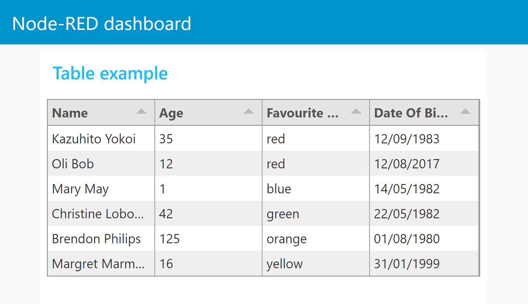
This table node expects msg.payload to contain an array of data, one object per row.
Each data row object should have the same set of keys because the keys in the object are used as the column names.
Both examples can be imported from the Node-RED Editor - Menu - Import - Examples
With no configuration the node will try to create a table with equally spaced columns of simple text for each row provided, using the keys as column titles.

The columns can be configured manually. If so then only the msg.payload properties defined will be displayed. You can then also define the Title, Width, Alignment and Format of the column.

[
    {
        "Name": "Kazuhito Yokoi",
        "Age": "35",
        "Favourite Color": "red",
        "Date Of Birth": "12/09/1983"
    },
    {
        "Name": "Oli Bob",
        "Age": "12",
        "Favourite Color": "cyan",
        "Date Of Birth": "12/08/2017"
    }
]
msg.ui_control messagesui-table is based on the tabulator module and can be customized by sending configuration data to msg.ui_control.tabulator. You can find an excellent in depth documentation here with many examples here.

by adding headers, footers, line or column grouping it is sometimes not possible to determine the amount of lines. Therefore the height can be defined by sending msg.ui_control.customHeight=lines.
Example flow "3 ui_control table.json" file can be found in the examples folder
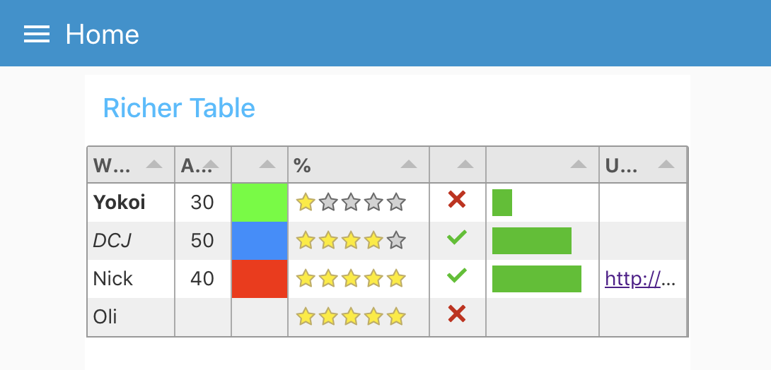
ui_control.tabulator.columnsfrozen from horizontal scrollingformatterParams to define min/max, color, legend or other parameters for progress and planText formatters// add a unit
var function(cell, formatterParams, onRendered){
return cell.getValue()+"°C";
}
or more sophisticated using html
// convert Number to Icons
var function(cell, formatterParams, onRendered){
    var html="<i class=\"";
    switch(cell.getValue()) {
        case 0: html+="fa fa-calendar-check-o"; break;
        case 1: html+="fa fa-hand-o-up"; break;
        case 2: html+="fa fa-suitcase"; break;
        case 3: html+="fa fa-spinner fa-spin fa-fw"; break;
    }
    html+='\"></i>';
    return html;
}
topCalc for average and min/max calculationstickCross formattertick formattergroupBy parameter to use group lines. groupHeader function to format legend and adding html tags (Insert a field name in the groupBy paramter at the end of json in the change node to use this feature)columnResized callback function to receive a message when the user resize a columncolumnResized = function(column){
var newColumn = {
field: column._column.field,
visible: column._column.visible,
width: column._column.width,
widthFixed: column._column.widthFixed,
widthStyled: column._column.widthStyled
};
this.send({
ui_control:{callback:'columnResized',columnWidths:newColumn}
});
}
this.send({}) to pass result to Node-RED. (to avoid a loopback addui_control.callback="someText") this.send({topic: "anyTopic",payload:"anyPayload",ui_control: {callback:"myCallback"}});
field instead of Property used in node configurationmsg.ui_control data is performed! So if you don`t get the results you expect take a look on your browsers console.FAQs
Table UI widget node for Node-RED Dashboard
The npm package node-red-node-ui-table receives a total of 3,234 weekly downloads. As such, node-red-node-ui-table popularity was classified as popular.
We found that node-red-node-ui-table demonstrated a healthy version release cadence and project activity because the last version was released less than a year ago. It has 0 open source maintainers collaborating on the project.
Did you know?

Socket for GitHub automatically highlights issues in each pull request and monitors the health of all your open source dependencies. Discover the contents of your packages and block harmful activity before you install or update your dependencies.

Security News
vlt's new "reproduce" tool verifies npm packages against their source code, outperforming traditional provenance adoption in the JavaScript ecosystem.

Research
Security News
Socket researchers uncovered a malicious PyPI package exploiting Deezer’s API to enable coordinated music piracy through API abuse and C2 server control.

Research
The Socket Research Team discovered a malicious npm package, '@ton-wallet/create', stealing cryptocurrency wallet keys from developers and users in the TON ecosystem.