Security News
vlt Launches "reproduce": A New Tool Challenging the Limits of Package Provenance
vlt's new "reproduce" tool verifies npm packages against their source code, outperforming traditional provenance adoption in the JavaScript ecosystem.
nuxt-rating
Advanced tools

nuxt-rating dependency to your project# Using pnpm
pnpm add nuxt-rating
# Using yarn
yarn add nuxt-rating
# Using npm
npm install nuxt-rating
nuxt-rating to the modules section of nuxt.config.tsexport default defineNuxtConfig({
modules: ["nuxt-rating"],
});
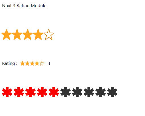
nuxt-rating component<NuxtRating :read-only="false" :ratingValue="3.5" />

The following props can be passed to customize the appearance and behavior of the component:
ratingCount (optional, default: 5): The total number of rating levels available.ratingSize (optional, default: "32px"): The size of the rating meter.letterSpacing (optional, default: "0px"): The spacing between the rating levels.activeColor (optional, default: "#ffc700"): The color of the active rating level.inactiveColor (optional, default: "gray"): The color of the inactive rating levels.ratingValue (optional, default: 3.7): The initial rating value.ratingContent (optional, default: "[19.8, 2.2, 6.6, 43.56, 39.6, 17.16, 0, 17.16, 33, 43.56]"): The content to be displayed for each rating level, should be polygon points see https://developer.mozilla.org/fr/docs/Web/SVG/Element/polygon.readOnly (optional, default: true): Specifies whether the rating meter is read-only or interactive.borderColor (optional, default: "#db8403"): The border color of the stars.borderWidth (optional, default: 0): The border width of the stars.roundedCorners (optional, default: false): Specifies whether the stars should have rounded corners.clearable (optional, default: false): Specifies whether the rating can be cleared.The component emits the following events:
ratingSelected: Triggered when a rating level is selected. The event payload is the selected rating value.ratingHovered: Triggered when the mouse hovers over the rating meter. The event payload is the hovered rating value.
<template>
  <div class="p-4">
    <h1 style="margin-bottom: 0px">Nuxt 3 Rating Module</h1>

    <br />
    <br />
    <br />

    <NuxtRating
      border-color="#db8403"
      active-color="#ffa41c"
      inactive-color="#fff"
      :rating-step="0.5"
      :rounded-corners="true"
      :border-width="5"
      :fixed-points="2"
      :rating-size="30"
      :rating-value="4.5"
      @rating-selected="logRating"
      @rating-hovered="event => (rating = event)" />

    <br />
    <br />
    <br />

    <div class="flex items-center">
      <p>Rating :</p>
      <NuxtRating
        class="px-3"
        border-color="#db8403"
        active-color="#ffa41c"
        inactive-color="#fff"
        :rating-step="0.1"
        :rounded-corners="true"
        :border-width="5"
        :fixed-points="2"
        :rating-size="10"
        :rating-value="3.7"
        @rating-selected="logRating"
        @rating-hovered="event => (rating = event)" />
      <p>{{ rating }}</p>
    </div>

    <br />
    <br />
    <br />

    <NuxtRating
      active-color="red"
      inactive-color="#333"
      :rating-spacing="5"
      :rating-step="1"
      :rating-count="10"
      :rounded-corners="true"
      :rating-content="[
        19.305, 12.611, 25.25, 9.178, 21.9171, 3.4049, 15.9722, 6.8377, 15.9722, 0, 9.30556, 0,
        9.30556, 6.8377, 3.36056, 3.4049, 0.0277222, 9.178, 5.97222, 12.611, 0.0277778, 16.044,
        3.36056, 21.8173, 9.30556, 18.3847, 9.30556, 25.2778, 15.9722, 25.2778, 15.9722, 18.3847,
        21.9171, 21.8173, 25.25, 16.044,
      ]"
      :border-width="0"
      :fixed-points="2"
      :rating-size="30"
      :rating-value="4.5"
      @rating-selected="logRating" />
  </div>
</template>

<script setup lang="ts">
  import { ref } from 'vue'

  const rating = ref(0)

  const logRating = (event: number) => {
    console.log(event)
  }
</script>
0.1.0
0d4c34f: Update to 0.0.16
FAQs
Display or retrieve a score on a fully customisable scale.
The npm package nuxt-rating receives a total of 476 weekly downloads. As such, nuxt-rating popularity was classified as not popular.
We found that nuxt-rating demonstrated a healthy version release cadence and project activity because the last version was released less than a year ago. It has 0 open source maintainers collaborating on the project.
Did you know?

Socket for GitHub automatically highlights issues in each pull request and monitors the health of all your open source dependencies. Discover the contents of your packages and block harmful activity before you install or update your dependencies.

Security News
vlt's new "reproduce" tool verifies npm packages against their source code, outperforming traditional provenance adoption in the JavaScript ecosystem.

Research
Security News
Socket researchers uncovered a malicious PyPI package exploiting Deezer’s API to enable coordinated music piracy through API abuse and C2 server control.

Research
The Socket Research Team discovered a malicious npm package, '@ton-wallet/create', stealing cryptocurrency wallet keys from developers and users in the TON ecosystem.