React-3DM-Carousel is a powerful and versatile carousel component for React applications. With its captivating 3D effect, it provides an exceptional way to showcase your gallery, portfolio, or projects in an engaging and visually appealing manner.
Key Features:
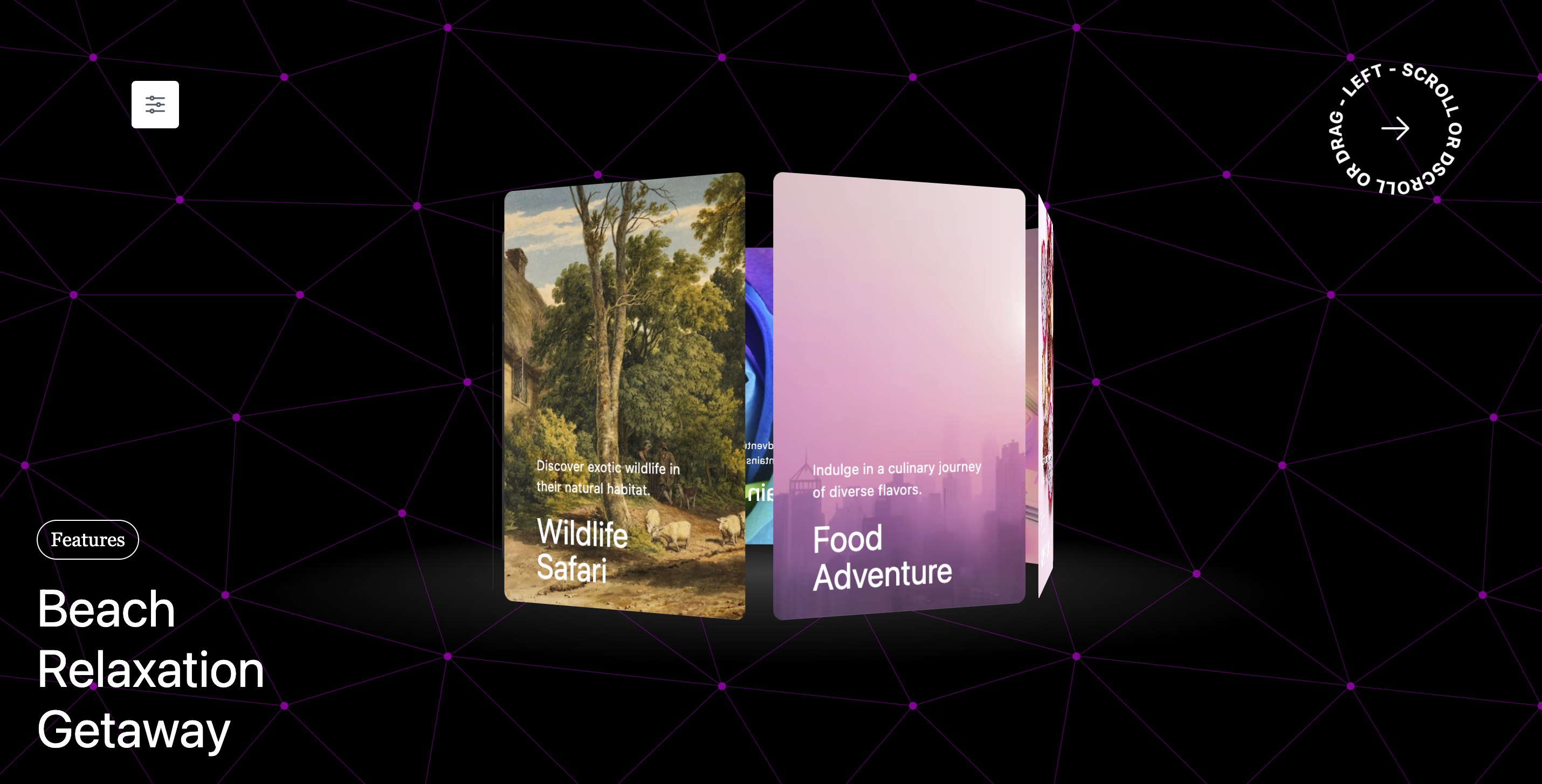
1- Immersive 3D Carousel:
The React-3DM-Carousel offers an eye-catching 3D carousel, adding depth and interactivity to your content.
2- Smooth Dragging and Gesture Support:
Experience seamless dragging on touch and mouse, providing a responsive and intuitive interaction.
3- Interactive Scrolling:
Rotate the carousel with ease using scrolling, enhancing interactivity and navigation.
4- Customizable Cards and Images:
Easily modify displayed cards and images to suit your needs, offering complete visual control.
5- Flexible Feature Control:
Comprehensive feature control to enable, disable, or customize functionalities according to your requirements.
Example

Installation and usage
Install it via npm:
npm i react-3dm-carousel
or yarn:
yarn add react-3dm-carousel
Then import the Carousel component like so :
import { Carousel } from 'react-3dm-carousel';
All you need to do:
import { Carousel } from "react-3dm-carousel";
const App = () => {
 return (
    <div className="">
      <Carousel />
    </div>
  );
}
Carousel with all the props
import { Carousel } from "react-3dm-carousel";
const App = () => {
  const onTitleClickHandler =(card:CardType)=>{
    console.log("clicked card",card)
  }
  const [selectedCardIdx,setSelectedCardIdx]=useState(0)
 return (
    <div className="">
      <Carousel
        cardsData={data}
        setSelectedCardIdx={setSelectedCardIdx}
        rotation={true}
        rotationDuration={60}
        tilt={true}
        freeRoam={false}
        freeRoamLowerBounds={-180}
        freeRoamUpperBounds={0}
        onTitleClickHandler={onTitleClickHandler}
        startingAnimation={true}
        rotateOnScroll={true}
        drag={true}
      />
    </div>
  );
}
And you're all set. You can also use props for better control of how the carousel looks and behaves:
Props
| Name | Default value | Description |
|---|
| cardsData | dummy data | An array containing elements of the form [{ id: string; title: string; description: string; image: string; routeTo?: string }] where key holds any unique value, title and description for the title and description and image url for the background image of the card. |
| startingAnimation | true | Optional Enable or disable the starting animation of the carousel. Defaults to true. |
| rotateOnScroll | true | Optional Enable or disable the rotating of the carousel on scroll. Defaults to true. |
| drag | true | Optional Enable or disable the dragging of the carousel. Defaults to true. |
| rotation | true | Optional Enable or disable rotation of the carousel. Defaults to true (rotation is enabled). |
| rotationDuration | 60 | Optional time in seconds it takes to complete a full rotation. Only applicable when rotation is enabled. defaults to 60 seconds. |
| tilt | true | Optional Cool tilt effect on Carousel relative to mouse position. defaults to true. |
| setSelectedCardIdx | undefined | Optional React state setter to pass your setState to Carousel. defaults to undefined. |
| freeRoam | false | Optional Enables the user to freely rotate and move around the carousel canvas. defaults to false enabling this feature will cause the tilt to disable. |
| freeRoamUpperBounds | 0 | Optional define the upper bounds of the free roam. make upper bounds to 360 and lower bounds to -360 to move in all directions. |
| freeRoamLowerBounds | -180 | Optional define the upper bounds of the free roam. make upper bounds to 360 and lower bounds to -360 to move in all directions. |
| onTitleClickHandler | ()=>{} | Optional Provide an onclick handler function for title, when it is clicked it will return the clicked card. defaults to ()=>{}. /- Can be useful if you want to route to another path that you defined in your function. |


