Security News
vlt Launches "reproduce": A New Tool Challenging the Limits of Package Provenance
vlt's new "reproduce" tool verifies npm packages against their source code, outperforming traditional provenance adoption in the JavaScript ecosystem.
react-hint
Advanced tools
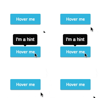
React-hint is a small tooltip component for React which is developed with simplicity and performance in mind. It also plays nicely with Preact and Inferno. There is a demo page.


npm i -S react-hint
| ReactHint Property | Type | Default Value | Description |
|---|---|---|---|
| className | String | react-hint | <ReactHint /> is a singleton component. You can completely override the default tooltip style by passing className property with a new base class name. |
| Element Attribute | Type | Default Value | Description |
|---|---|---|---|
| data-rh | String or #element-id | To show a tooltip on any DOM element and its children add data-rh attribute with a tooltip text to the element. Pass #element-id instead of a text to show the element's HTML content. | |
| data-rh-at | top, left, right, bottom | top | The default placement of a tooltip is at the top, but you can add data-rh-at attribute to change the placement. |
| data-rh-cls | String | To customize a single tooltip add data-rh-cls with a class name which will be added to the tooltip. |
import React from 'react'
import {render} from 'react-dom'
import ReactHint from 'react-hint'
import 'react-hint/css/index.css'

class Demo extends React.Component {
	state = {count: 0}

	componentDidMount() {
		setInterval(() => {
			this.setState({count: this.state.count + 1})
			ReactHint.instance.forceUpdate()
		}, 1000)
	}

	render() {
		const {count} = this.state
		return (
			<div>
				<button data-rh="Default">Default</button>
				<button data-rh="Left" data-rh-at="left">Left</button>
				<button data-rh="Top" data-rh-at="top">Top</button>
				<button data-rh="Bottom" data-rh-at="bottom">Bottom</button>
				<button data-rh="Right" data-rh-at="right">Right</button>
				<button data-rh={`Count: ${count}`}>Count: {count}</button>
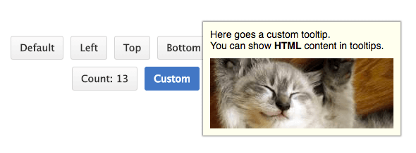
				<button data-rh="#custom" data-rh-cls="react-hint--custom">Custom</button>
				<ReactHint />

				<div style={{display: 'none'}} id="custom">
					Here goes a custom tooltip.<br />
					You can show <b>HTML</b> content in tooltips.
					<img src="//placekitten.com/260/100" />
				</div>
			</div>
		)
	}
}

render(<Demo />, document.getElementById('demo'))
react-hint uses shouldComponentUpdate under the hood to decide if it needs to be updated. You can use ReactHint.instance.forceUpdate() in case you want to force an update.
MIT
FAQs
Tooltip component for React, Preact, Inferno
The npm package react-hint receives a total of 4,285 weekly downloads. As such, react-hint popularity was classified as popular.
We found that react-hint demonstrated a not healthy version release cadence and project activity because the last version was released a year ago. It has 1 open source maintainer collaborating on the project.
Did you know?

Socket for GitHub automatically highlights issues in each pull request and monitors the health of all your open source dependencies. Discover the contents of your packages and block harmful activity before you install or update your dependencies.

Security News
vlt's new "reproduce" tool verifies npm packages against their source code, outperforming traditional provenance adoption in the JavaScript ecosystem.

Research
Security News
Socket researchers uncovered a malicious PyPI package exploiting Deezer’s API to enable coordinated music piracy through API abuse and C2 server control.

Research
The Socket Research Team discovered a malicious npm package, '@ton-wallet/create', stealing cryptocurrency wallet keys from developers and users in the TON ecosystem.