Features
- Lightweight
- Out of the box loader
- Full Page Loader, Inline Loader
- Custom Loading Message
- Custom Styling Options
Installation
With Yarn
yarn add react-spinner-loader
With npm
npm i --save react-spinner-loader
Documentation
You could view the documentation in Github Page as well.
Usage
react-spinner-loader is compatible with both Class and Functional React Components.
import Loader from 'react-spinner-loader';
const App = () => {
    const [loader, setLoader] = useState(true);
    return (
        <div>
            <Loader show = {loader}>
        </div>
    )
}
Available Custom Props
By default, react-spinner-loader comes up with the following properties. You could use the following to customize your loader out of the box.
| Prop | Optional | Default | Possible Values | Description |
|---|
| show | No | false | true | false | To Show/Hide Loader |
| type | Yes | inline | inline | box | body | To show either full page or inline loader |
| message | Yes | - | User Custom String | To show Loading Message |
| stack | Yes | horizontal | horizontal | vertical | To decide the position of spinner and message |
| spinnerStyle | Yes | |
Any Primary and Secondary Color.
| To change the color of spinner |
| spinnerSize | Yes |
40px
|
Size in px | em | rem
| To change the size of spinner |
| messageStyle | Yes |
#101010 (Inline)
#FFFFFF (Other)
|
CSS Properties
| To change the style of messages |
Example
Prop : type
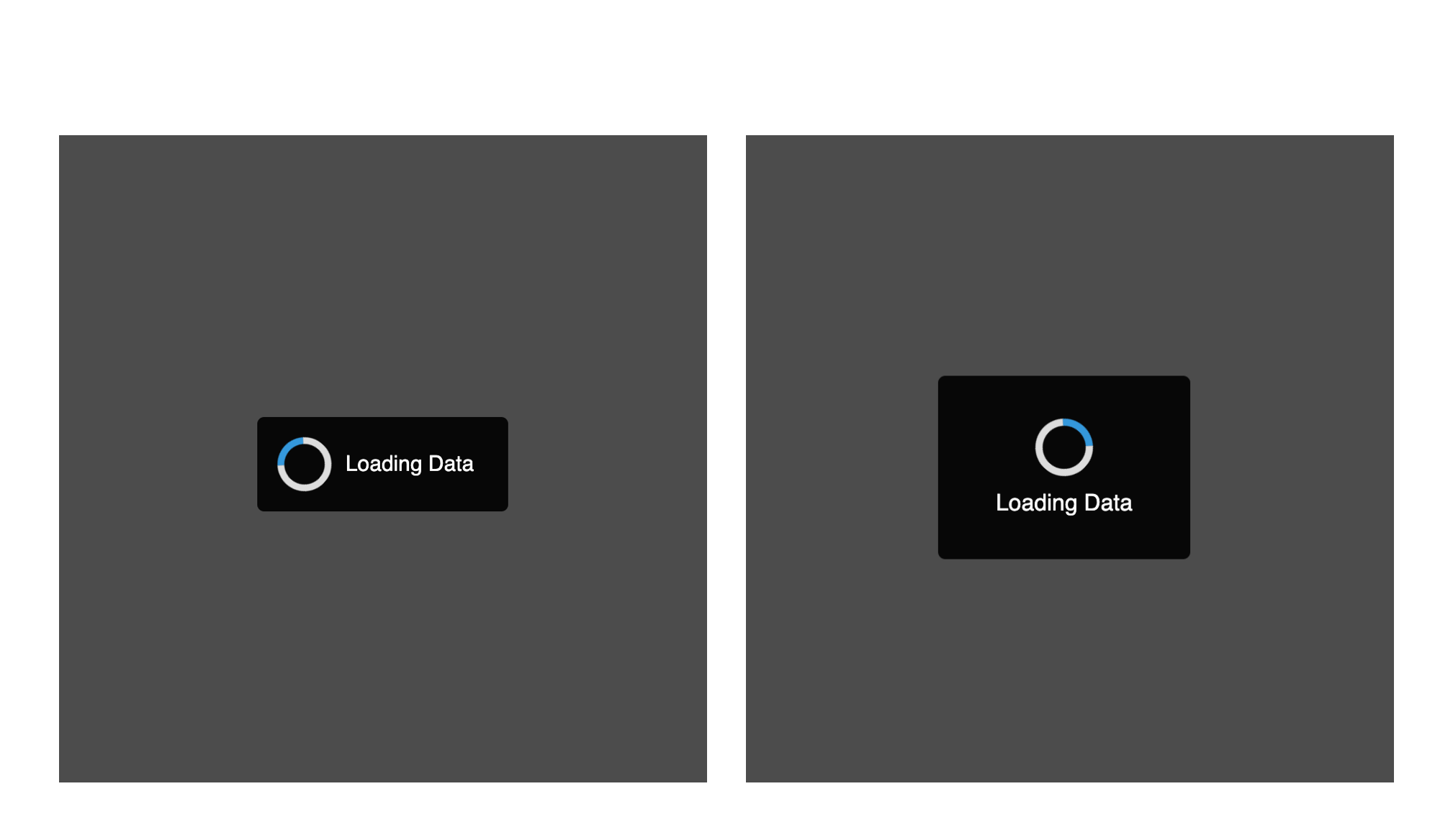
To show inline loaders, use type = "inline". This is the default value.
<Loader show = {loader} type = "inline" />
View on Sandbox
To show a full page loader with blur background, use type = "body"
<Loader show = {loader} type = "body" />
View on Sandbox
To show a full page loader without blur background, then use type = "box"
<Loader show = {loader} type = "box" />
View on Sandbox
Prop : message and messageStyle
Many times, we would want to provide a loading message along with the loader to help user understand why is it taking a lot of time to load the data.
To achieve this, you could pass custom loading string with message prop.
Alternatively, you could also configure the message styling with messageStyling prop.
<Loader
    show = {loader}
    message = "Loading Message"
    messageStyling = {{
        color: blue
    }}
/>
Prop : stack
This prop would help to place message either horizontally or vertically with respect to the spinner.
<Loader show = {loader} stack = "vertical"/>
View on Sandbox
Prop : spinnerStyle
Want to align the spinner with your website theme? You could always use spinnerStyle prop to customize the loader colors.
<Loader
    show = {loader}
    spinnerStyle = {{
        primary: '#46B597',
        secondary: '#2D866D'
    }}
/>
Prop : spinnerSize
Increase or Decrease the spinner size with spinnerSize
<Loader show = {loader} spinnerSize = "50px"/>


