v-dialogs
A simple and powerful dialog for Vue2, dialog type including Modal, Alert, Mask and Toast


Demos and Documents
Explorer on
The jQuery version: bDialog
The Dialog Icon
the icons in alert dialog used are made by Elegant Themes
and control icon, toast icon used are come from IconFont
Vue plugin series
| Plugin | Status | Description |
|---|
| v-page |  | A simple pagination bar, including length Menu, i18n support |
| v-dialogs | | A simple and powerful dialog, including Modal, Alert, Mask and Toast modes |
| v-tablegrid |  | A simpler to use and practical datatable |
| v-uploader |  | A Vue2 plugin to make files upload simple and easier,
you can drag files or select file in dialog to upload |
| v-ztree |  | A simple tree for Vue2, support single or multiple(check) select tree,
and support server side data |
| v-gallery |  | A Vue2 plugin make browsing images in gallery |
| v-region |  | A simple region selector, provide Chinese administrative division data |
| v-selectpage |  | A powerful selector for Vue2, list or table view of pagination,
use tags for multiple selection, i18n and server side resources supports |
| v-suggest |  | A Vue2 plugin for input suggestions by autocomplete |
| v-playback |  | A Vue2 plugin to make video play easier |
| v-selectmenu |  | A simple, easier and highly customized menu solution |
Install
npm i v-dialogs --save
Include plugin in your main.js file.
import Vue from 'vue'
import vDialog from 'v-dialogs';
Vue.use(vDialog);
Use case
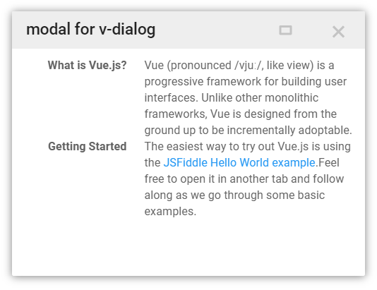
Modal
import myComponent from './myComponent';
new Vue({
el: '#app',
methods: {
click(){
this.$vDialog.modal(myComponent, {
params: {
a: 1,
b: 2
}
});
}
}
});
receive params in component
export default {
name: 'myComponent',
props: ['params']
data(){
console.log(this.params);
return {};
}
}
close dialog and return data in component
export default {
name: 'myComponent',
props: ['params']
data(){
console.log(this.params);
return {};
},
methods: {
closeDialog(){
let data = {
a: 2,
b: 4
};
this.$vDialog.close(data);
}
}
}
Alert
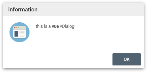
this.$vDialog.alert('This is a <b>Vue</b> dialog plugin: vDialog!');
this.$vDialog.alert('This is a <b>Vue</b> dialog plugin: vDialog!',function(){
});
this.$vDialog.alert('This is a <b>Vue</b> dialog plugin: vDialog!',function(){
},{
messageType: 'error',
closeTime: 2,
language: 'en'
});
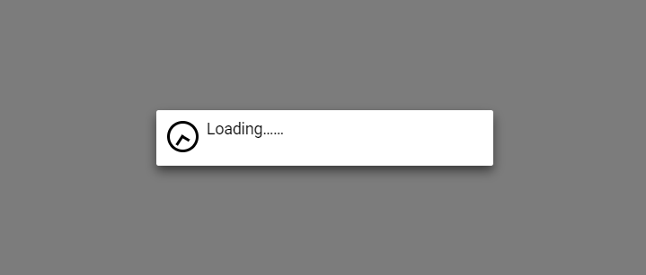
Mask
this.$vDialog.mask();
this.$vDialog.mask('my data loading...');
this.$vDialog.mask('my data loading...', function(){
});
some time, you can use mask like this:
let that = this;
let dialogKey = this.$vDialog.mask();
axios.post(...).then(resp){
that.$vDialog.close(null, dialogKey);
};
Toast
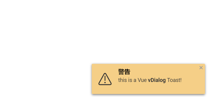
open a Toast dialog in a corner
this.$vDialog.toast('This is a Vue <b>vDialog</b> Toast!');
this.$vDialog.toast('This is a Vue <b>vDialog</b> Toast!', function(){
});
this.$vDialog.toast('This is a Vue <b>vDialog</b> Toast!',null, {
messageType: 'warning',
position: 'topLeft',
dialogCloseButton: false,
closeTime: 3
});
messageType:
- 'info'(default)
- 'warning'
- 'error'
- 'success'
position:
- 'topLeft'
- 'topCenter'
- 'topRight'
- 'bottomLeft'
- 'bottomCenter'
- 'bottomRight'


