Security News
vlt Launches "reproduce": A New Tool Challenging the Limits of Package Provenance
vlt's new "reproduce" tool verifies npm packages against their source code, outperforming traditional provenance adoption in the JavaScript ecosystem.
cv2_gui is a Python library for creating GUI elements using OpenCV.
cv2_gui simplifies creating GUI elements, such as buttons, sliders, and more, with OpenCV.
pip install cv2_gui
This will also install dependencies such as cv2 and numpy.
| Button Type | Description | Example Usage |
|---|---|---|
| Toggle Button | Switch between two states. | create_toggle_button |
| Cycle Button | Cycle through a list of options. | create_cycle_button |
| Slider | Adjust a value within a range. | create_slider |
| Eyedropper | Select a color from an image. | create_eyedropper |
| D-Pad | Control directional movements. | create_dpad |
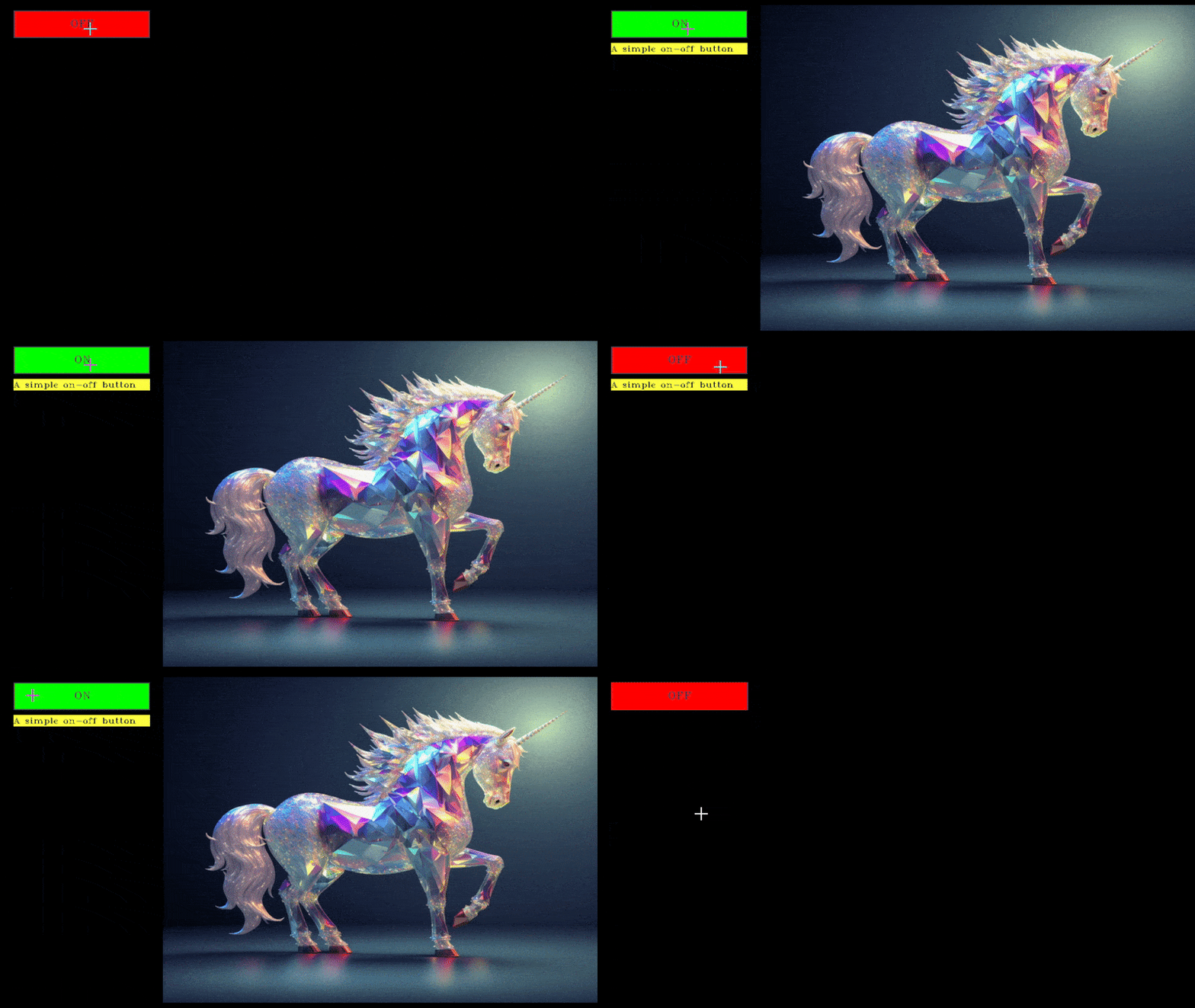
Toggle button can switch between on and off state performing 1 of 2 actions based on current state.
create_toggle_button| Parameter Name | Description | Type |
|---|---|---|
on_text | The text displayed on the button when it is in the "on" state. | str |
off_text | The text displayed on the button when it is in the "off" state. | str |
on_callback | The function that will run when the button is in the "on" state. | function |
off_callback | The function that will run when the button is in the "off" state. | function or None |
toggle_once | If True, will run the callback function every update; otherwise, it runs the callback only when the state changes. | bool |
on_color | The color of the button in the "on" state, represented as a list of RGB values. | List[float, float, float] |
off_color | The color of the button in the "off" state, represented as a list of RGB values. | List[float, float, float] |
keybind | This is a shortcut key which will trigger the button. | str |
tooltip | The text displayed when you hover over the button, providing additional information about the button's state. | str |
a basic function that will be executed based on button state
def display_image(img):
    return img[0]
import toggle button, button manager and dependecies from library.
from cv2_gui import create_button_manager, create_toggle_button
import cv2
import numpy as np

toggle=create_toggle_button('ON','OFF',display_image,display_image,tooltip="A simple on-off button")
this will create a button which when pressed will display the passed image.
sample = cv2.imread('sample.png')
while 1:
    output = toggle.update([sample],[None])
    output = create_button_manager.update(output)
first argument of update is argument_on which will be passed to on_callabck and second argument is argument_off passed to off_callback these are run when the corresponding state is active.
You can press q to close the window and stop execution,
Hovering over the button will display the tooltip.
Pressing keybind on the keyboard will switch between the states.

Toggle Button Demo
Cycle button can switch between multiple states performing various actions based on current state.
create_cycle_button| Parameter | Description | Type |
|---|---|---|
modes | The text that will be displayed on the button when in a particular mode. | List of Strings |
callbacks | The functions that will run when the button is in a selected mode. | List of Functions |
toggle_once | If True, the callback function runs every update; if False, runs once per state change. | Boolean |
tooltip | Text displayed when you hover the mouse on the button, providing further information. | String |
a basic function that will be executed based on button state
def convert_img(arguments):
    type,frame=arguments

    if type.lower()=="hsv":
        frame=cv2.cvtColor(frame,cv2.COLOR_BGR2HSV)
    elif type.lower()=="rgb":
        frame=cv2.cvtColor(frame,cv2.COLOR_BGR2RGB)
    elif type.lower()=="bw":
        frame=cv2.cvtColor(frame,cv2.COLOR_BGR2GRAY)
        frame=cv2.merge([frame, frame, frame])

    return frame
import cycle button, button manager and dependecies from library.
from cv2_gui import create_button_manager, create_cycle_button
import cv2
import numpy as np

cycle=cycle=create_cycle_button(["BGR","RGB","BW"],[convert_img,convert_img,convert_img],tooltip="convert image color format")
this will create a button which when cycled will convert image formats of the passed image.
sample = cv2.imread('sample.png')
while 1:
    output = cycle.update([["BGR",output],["RGB",output],["BW",output]])
    output = create_button_manager.update(output)
first argument of update is arguments the first element of argument will be passed to first callback function and so on.
You can press q to close the window and stop execution,
Hovering over the button will display the tooltip.

Cycle Button Demo
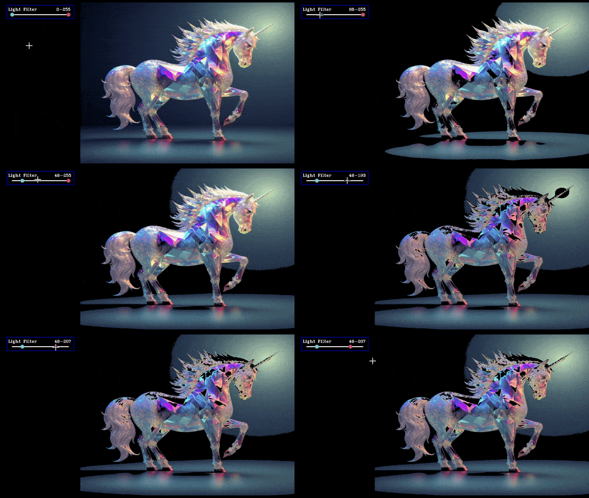
A slider allows users to adjust a value by dragging a handle along a track, with the value returned for use in other actions or settings.
create_slider| Parameter | Type | Description |
|---|---|---|
text | String | The text displayed as the label for the slider and its window. |
lower_range | int / float | The lower threshold or minimum value of the slider range. |
upper_range | int / float | The upper threshold or maximum value of the slider range. |
steps | int | The step size for the slider, which determines the granularity of adjustments. |
initial_value | int / float | The initial value that the slider starts with. If not provided, it defaults to the lower_range. |
ranged | Boolean | If True, creates a dual slider to select both minimum and maximum values within the range. If False, creates a single slider. |
return_int | Boolean | If True, ensures the slider's output is an integer. If False, allows for floating-point values (based on steps). |
return_odd_int | Boolean | If True, ensures the slider's output is an odd integer. Useful for tasks like setting kernel sizes in image processing. |
on_color | List (1x3) | RGB values defining the color of the slider's border or track when active. |
toggle_once | Boolean | If True, runs the associated callback function only once per state change. If False, continuously triggers the callback as the slider is adjusted. |
tooltip | String | The tooltip text shown when hovering over the slider or its associated label, providing additional information about its function. |
ranged = Falseimport slider, button manager and dependecies from library.
from cv2_gui import create_button_manager, create_slider
import cv2
import numpy as np

slider = create_slider("Blur",0,100,100,return_odd_int=True,tooltip="define values for blur amount")
this will create a slider which will store the current value and when we drag the slider update the value.
Alternatively you can use left and right arrow keys to move the last selected slider
while 1:
    sample = cv2.imread('sample.png')
    slider_val=slider.value
    sample = cv2.blur(sample, (slider_val,slider_val))
    create_button_manager.update(sample)
The value of the slider is stored in slider.value and is updated everytime button_manager.update() is called.
You can press q to close the window and stop execution,
Hovering over the button will display the tooltip.
Pressing r on the keyboard will reset all sliders to default state

Slider Demo
ranged = Truea basic function that will be executed with slider value.
def brightness_filter(frame,bounds):
    lower=bounds[0]
    upper=bounds[1]

    gray=cv2.cvtColor(frame.copy(),cv2.COLOR_BGR2GRAY)
    mask = cv2.inRange(gray, lower, upper)
    mask_3channel = cv2.merge([mask, mask, mask])
    filtered_image = cv2.bitwise_and(frame, mask_3channel)

    return filtered_image
import slider, button manager and dependecies from library.
from cv2_gui import create_button_manager, create_slider
import cv2
import numpy as np

slider = create_slider("Light Filter",0,255,200,ranged=True,return_odd_int=True,tooltip="define values for blur amount")
this will create a slider which will store the lower and upper value and when we drag the slider update the value.
Alternatively you can use left and right arrow keys to move the last selected slider
while 1:
    sample = cv2.imread('sample.png')
    lower=int(slider.value[0])
    upper=int(slider.value[1])
    output=brightness_filter(sample,[lower,upper])
    create_button_manager.update(output)
The value of the slider is stored in slider.value as a list where slider.value[0] is lower value, slider.value[1] is upper value and it is updated everytime button_manager.update() is called.
You can press q to close the window and stop execution,
Hovering over the button will display the tooltip.
Pressing r on the keyboard will reset all sliders to default state

Slider Ranged Demo
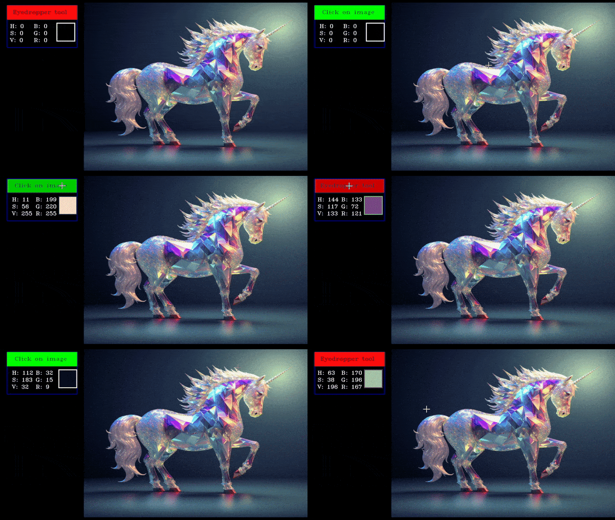
An eyedropper tool allows users to select a color from an image by clicking on the required pixel, displaying the selected color value.
create_eyedropper| Parameter | Type | Description |
|---|---|---|
text | String | The text displayed on the button. |
toggle_duration | Float | The duration (in seconds) for which the commanded function will execute before resetting. Overrides and resets if another key is pressed. |
toggle_once | Boolean | If true, the callback function will run on every update. If false, it will run once when the state changes. |
on_color | List(1x3) | The color of the button when it is pressed (RGB values). |
off_color | List(1x3) | The color of the button when it is released (RGB values). |
tooltip | String | The text displayed when hovering over the button, providing additional information about its states. |
import eyedropper, button manager and dependecies from library.
from cv2_gui import create_button_manager, create_eyedropper
import cv2
import numpy as np

dropper=create_eyedropper()
this will create an eyedropper tool which will show the pixel values in BGR and HSV of the clicked pixel.
while 1:
    sample = cv2.imread('sample.png')
    create_button_manager.update(sample)
You can press q to close the window and stop execution,
Hovering over the button will display the tooltip.
i is the shortcut key for eyedropper

Eyedropper Demo
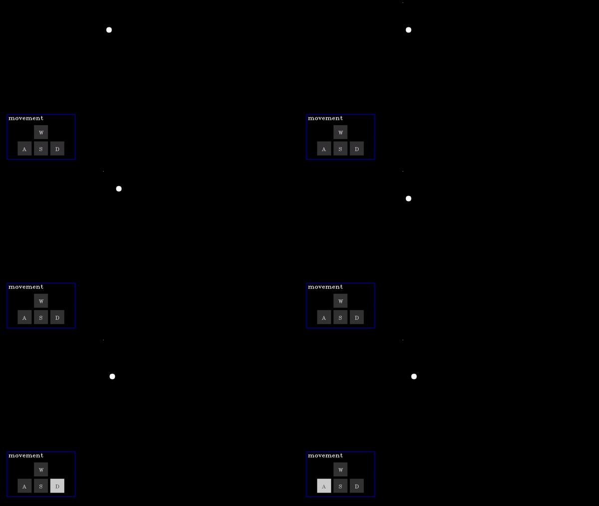
A D-pad (Directional pad) allows users to provide directional input (e.g., up, down, left, right) for navigation or control, with the selected direction respective action will be performed.
create_dpad| Parameter | Type | Description |
|---|---|---|
text | String | The text displayed on the button. |
toggle_duration | Float | The duration (in seconds) for which the commanded function will execute before resetting. Overrides and resets if another key is pressed. |
actions | List[functions] | A list of functions corresponding to actions for None, w (up), a (left), s (down), and d (right) key presses. |
toggle_once | Boolean | If true, the callback function will run on every update. If false, it will run once when the state changes. |
on_color | List(1x3) | The color of the button when it is pressed (RGB values). |
off_color | List(1x3) | The color of the button when it is released (RGB values). |
tooltip | String | The text displayed when hovering over the button, providing additional information about its states. |
Basic functions which will be executed when corresponding button in pressed.
global x,y
x=100
y=100
def w_action():
    global x,y
    y-=2

def a_action():
    global x,y
    x-=2

def s_action():
    global x,y
    y+=2

def d_action():
    global x,y
    x+=2
import Dpad, button manager and dependecies from library.
from cv2_gui import create_button_manager, create_dpad
import cv2
import numpy as np

dpad=create_dpad(actions=[None,w_action,a_action,s_action,d_action])
this will create a Dpad which moves a ball up, down, left, right according to direction pressed.
while 1:
    black_image=np.zeros((600,800,3))
    cv2.circle(black_image,(x,y),10,(1,1,1),-1)
    create_button_manager.update(black_image)
Corresponding key will highlight on the window to indicate which key is pressed.
You can press q to close the window and stop execution,
Hovering over the button will display the tooltip.

Dpad Demo
FAQs
A library to create buttons using OpenCV (cv2)
We found that cv2-gui demonstrated a healthy version release cadence and project activity because the last version was released less than a year ago. It has 1 open source maintainer collaborating on the project.
Did you know?

Socket for GitHub automatically highlights issues in each pull request and monitors the health of all your open source dependencies. Discover the contents of your packages and block harmful activity before you install or update your dependencies.

Security News
vlt's new "reproduce" tool verifies npm packages against their source code, outperforming traditional provenance adoption in the JavaScript ecosystem.

Research
Security News
Socket researchers uncovered a malicious PyPI package exploiting Deezer’s API to enable coordinated music piracy through API abuse and C2 server control.

Research
The Socket Research Team discovered a malicious npm package, '@ton-wallet/create', stealing cryptocurrency wallet keys from developers and users in the TON ecosystem.